Thanks
")
Yup, perfect. Thanks for expanding on the concept. I'll add a rough 2.35:1 grid just for reference, too:
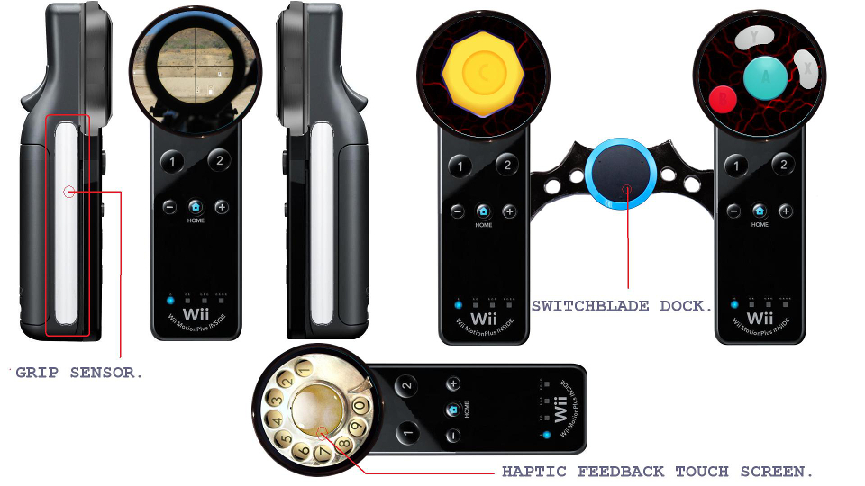
All vital visuals/HUD elements would go in green, all other (not as important) reference material in red. Just because the areas in red can often be covered by your hands, though, doesn't mean the screen estate used there is wasted and therefore not useful. In this very simple implementation of a Zelda HUD, with the XABY buttons, a quick lift of the thumb would show you which button corresponds to which item. The Gear, Map, and Item functions usually available on the 3DS' lower screen could perhaps be able to be brought up by simply tapping on the lower part of the main screen. That's one idea.
So far, we've only explored basic button labels. But obviously, there's limitless and better uses for a wraparound screen concept like this. For example, take something like ammo count: instead of that number being tucked away on the corner HUDs of a traditional screen, the number is right there next to the button your finger is on for super quick, easy to locate reference. Or take something like, an action you can only perform a limited amount times. Maybe a speed boost that you can only perform 3 times in a row before having to wait 5 seconds to recharge. You would have 3 big bars wrapped around their corresponding button, each bar depleting everytime time you used a boost. The bars would appear to be wrapped around your thumb. Then when you're all out of speed boosts, a big outer ring takes their place and it depletes for 5 seconds, letting you know how long it'll take to recharge your power.
As far as ergonomics, I reckon if you were just to take the back of the Wii U's GamePad, slim it up and slap it on the back of the device, you'd end up with something pretty comfortable: