eso76
Member
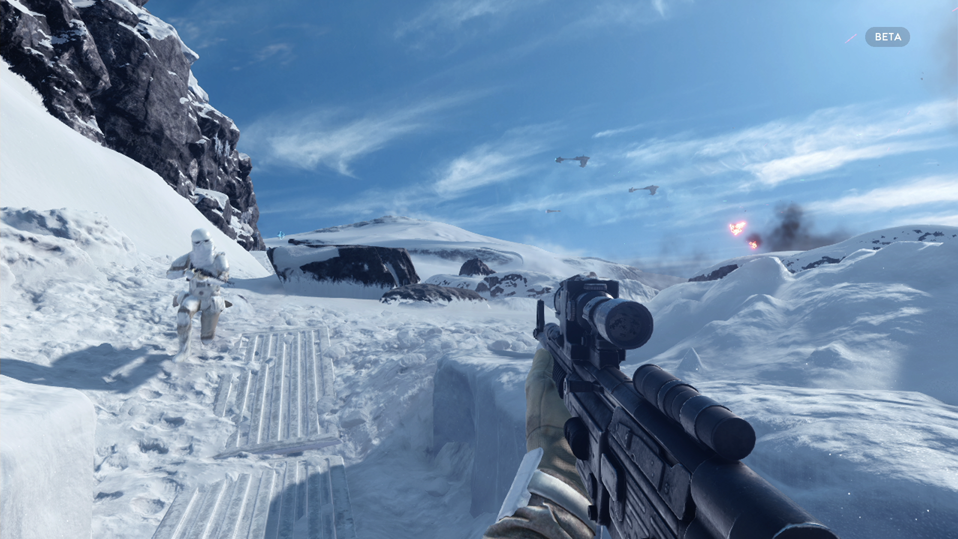
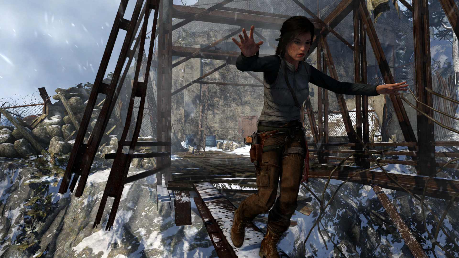
(ah, so there IS motion blur. nice !)
and people complained when they read (mind you, "read", not "noticed") XB1 version is 720p.
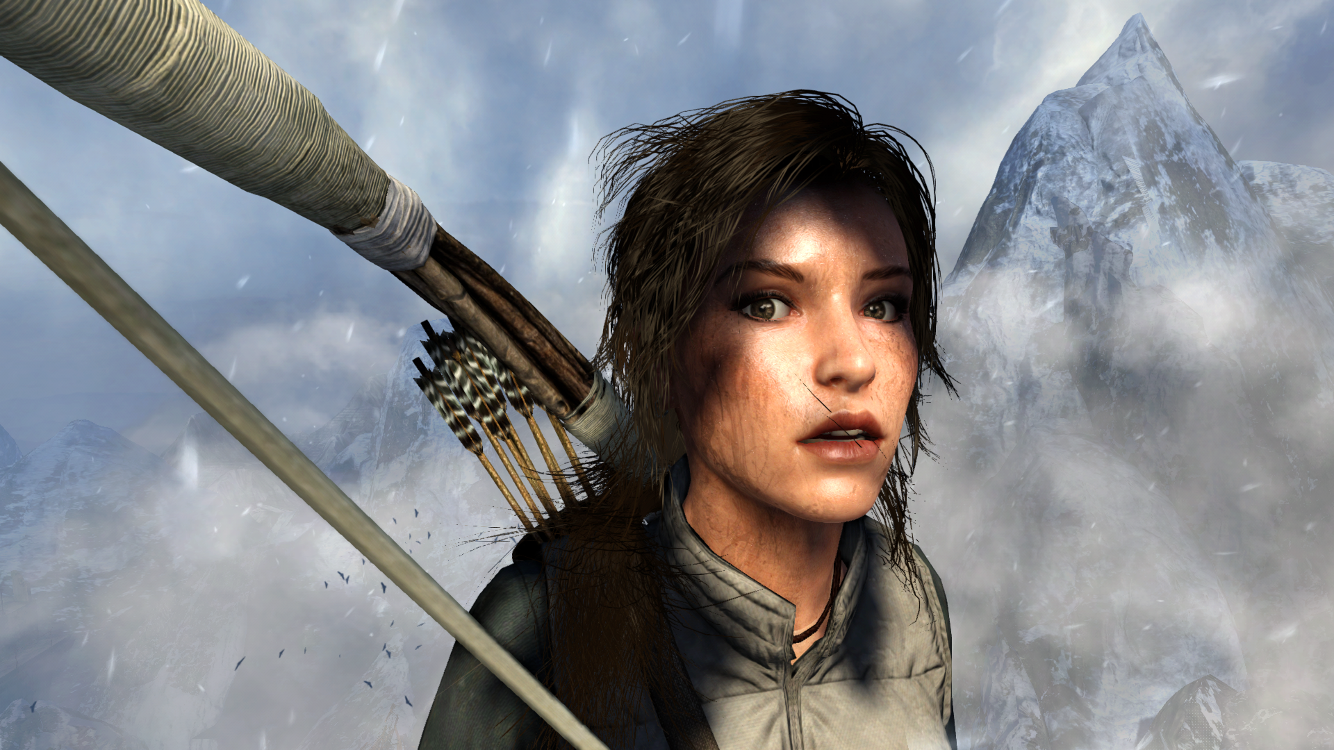
This looks friggen incredible, especially for 60fps.
it's like the camera went off accidentally a bunch of times lol
")
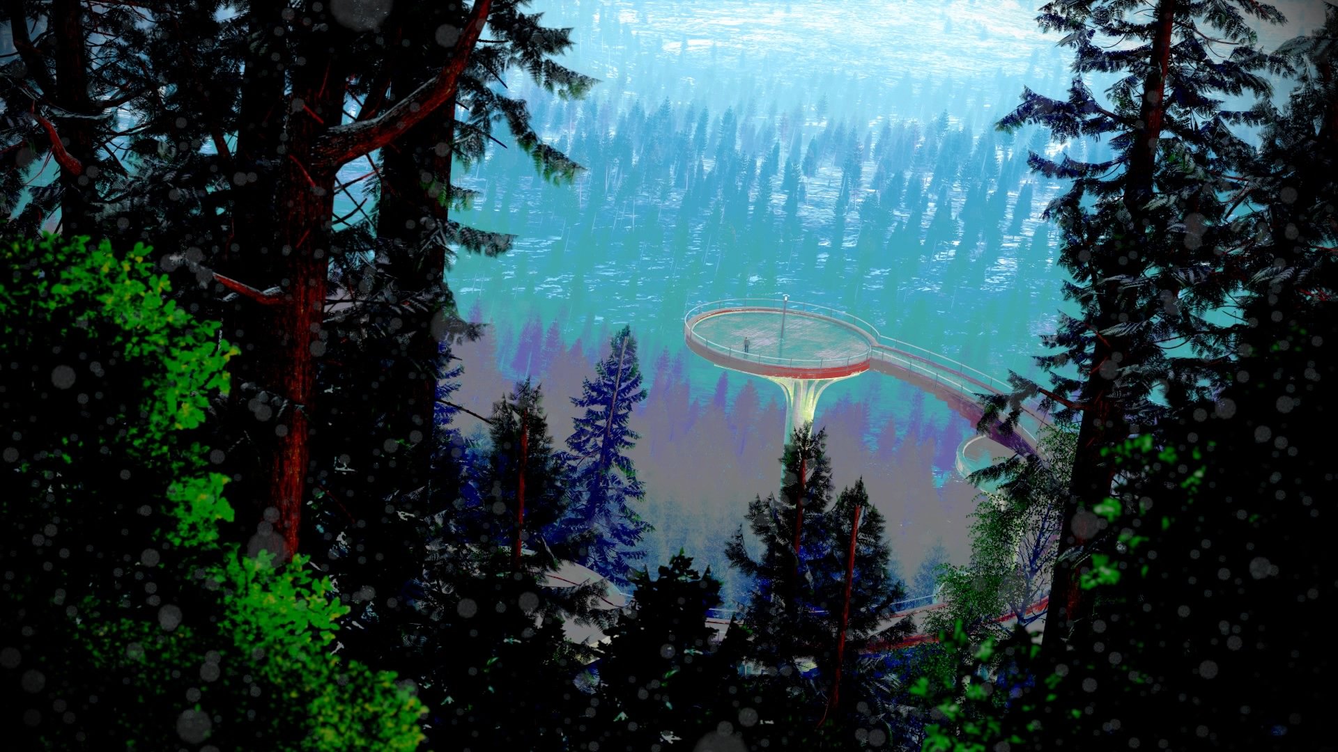
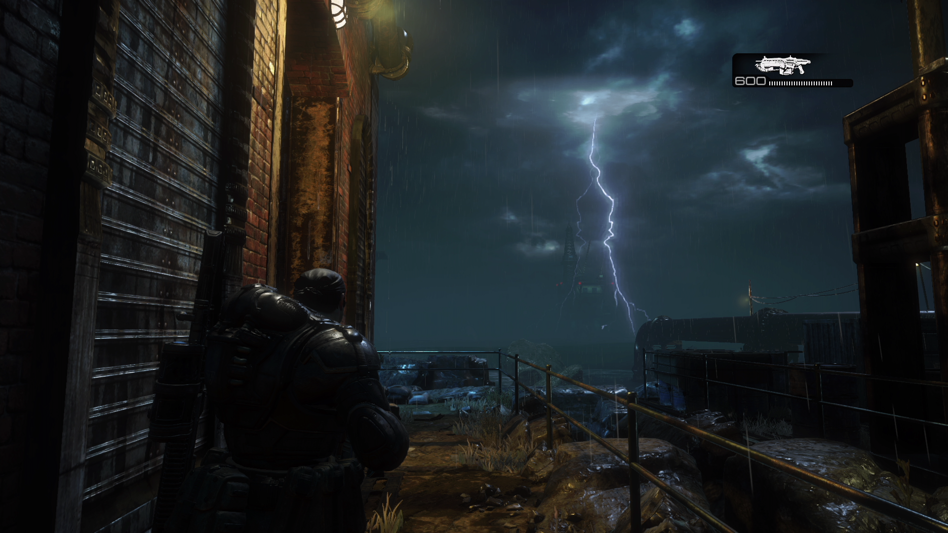
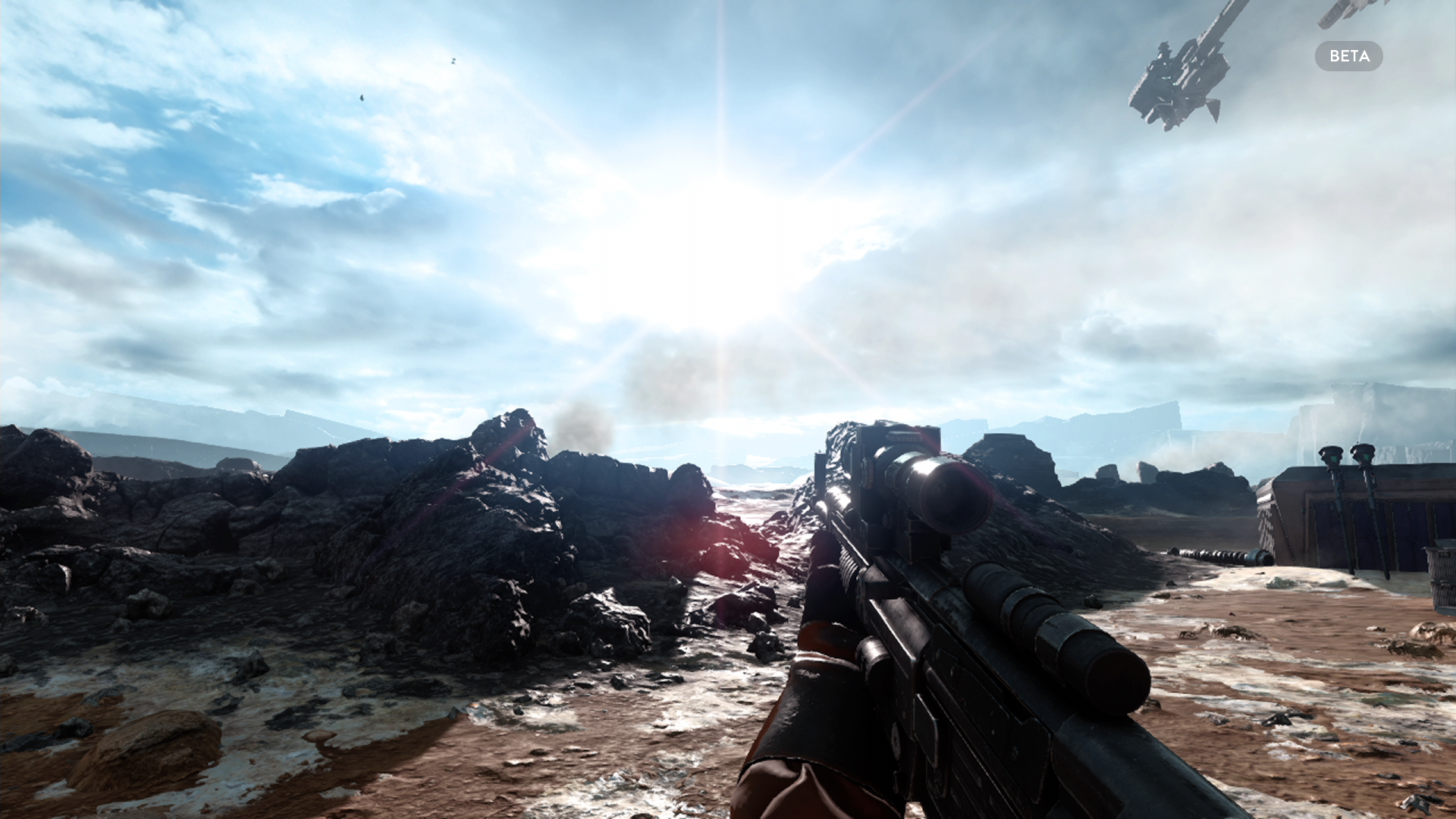
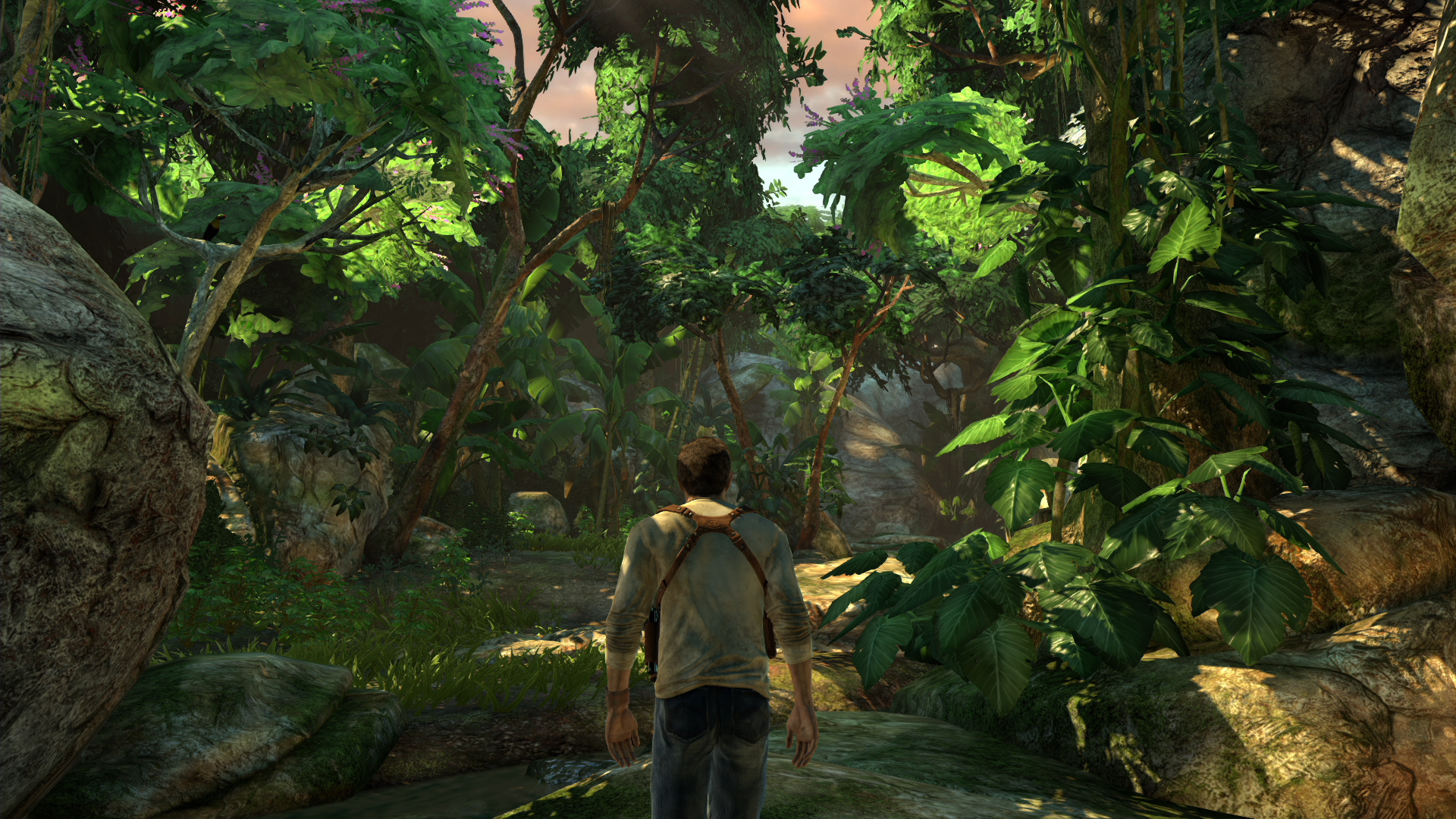
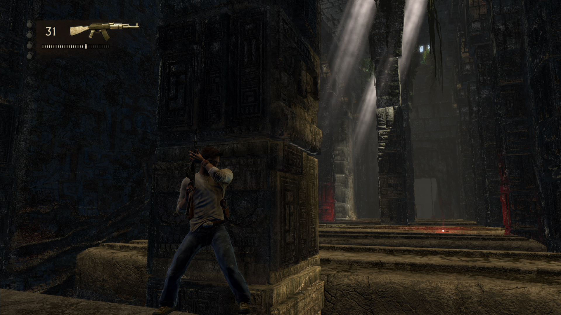
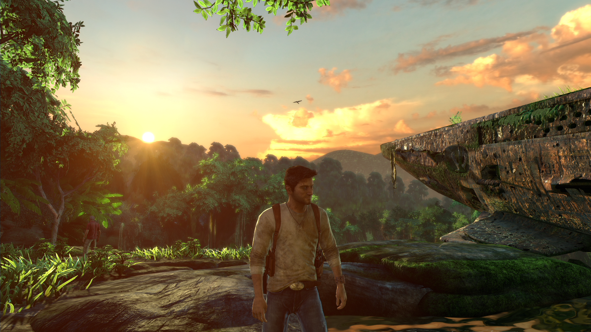
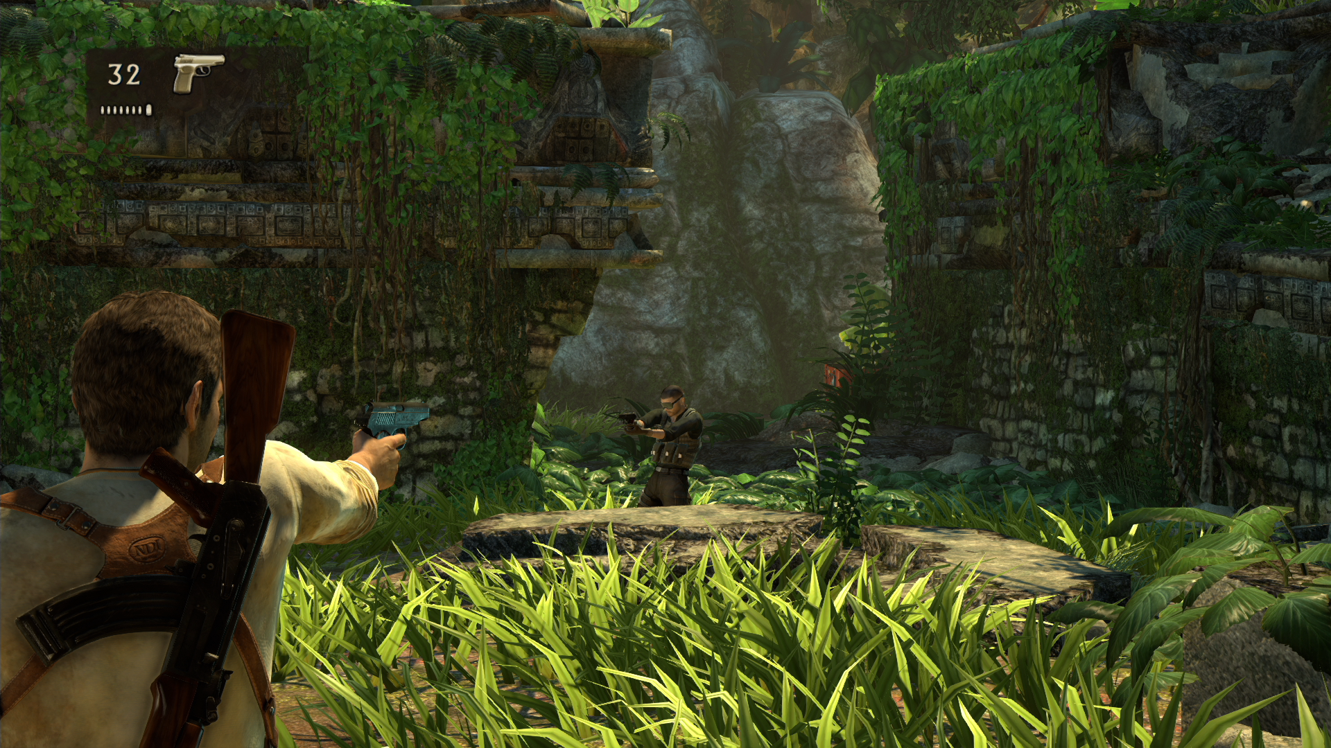
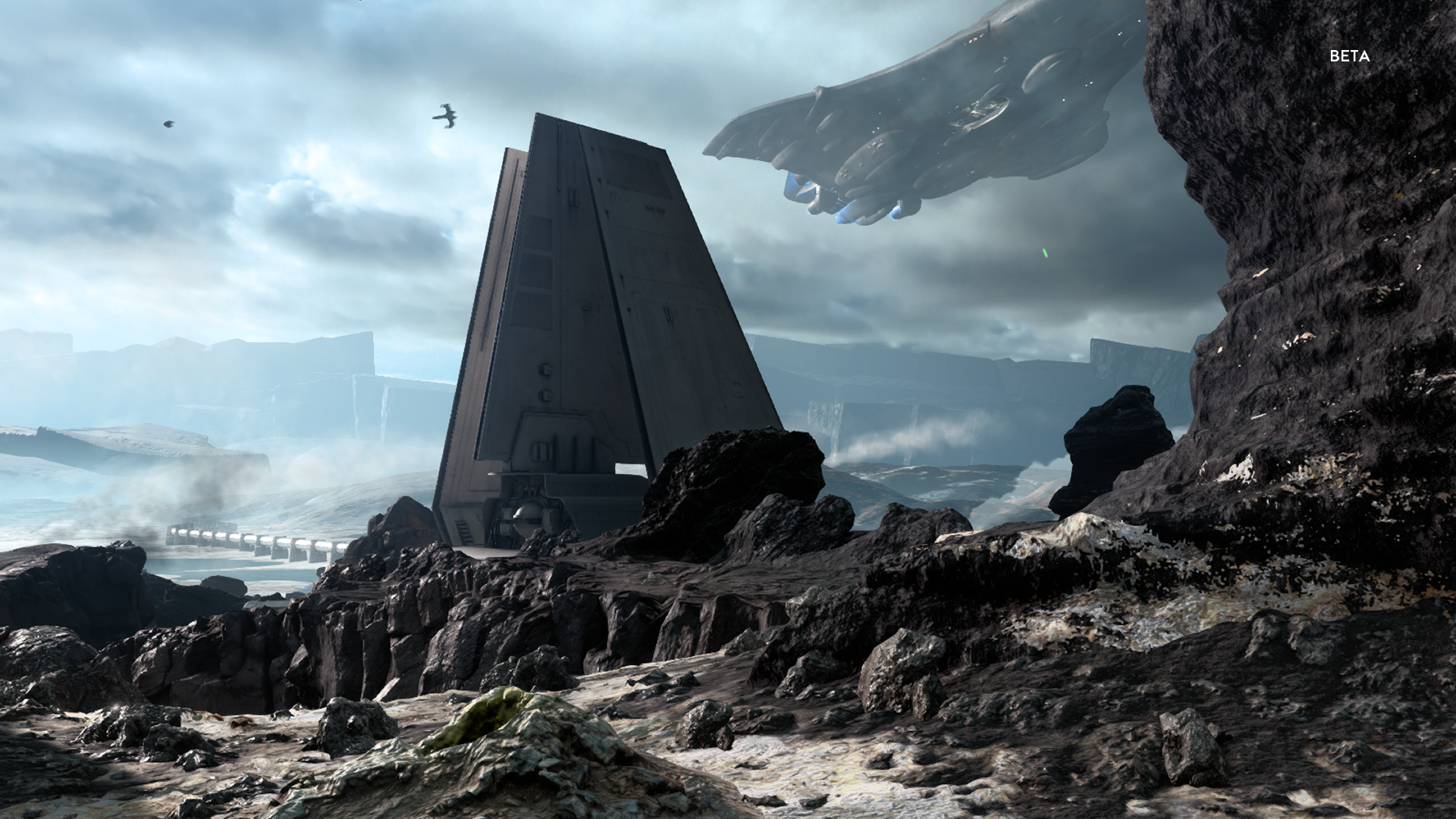
its a last canada track add.. ^^
more screen on same track

(ah, so there IS motion blur. nice !)
and people complained when they read (mind you, "read", not "noticed") XB1 version is 720p.
This looks friggen incredible, especially for 60fps.
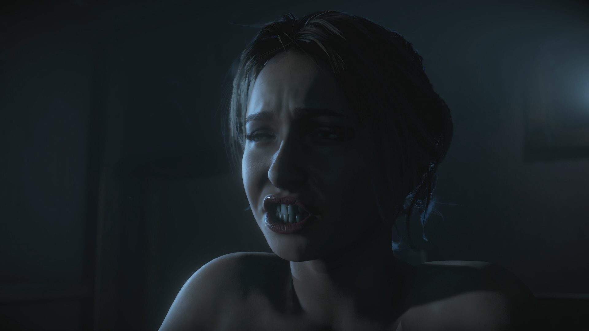
The CA in Bloodborne is disgusting.


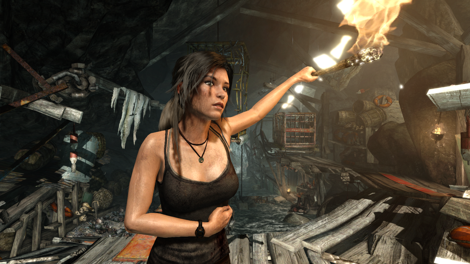
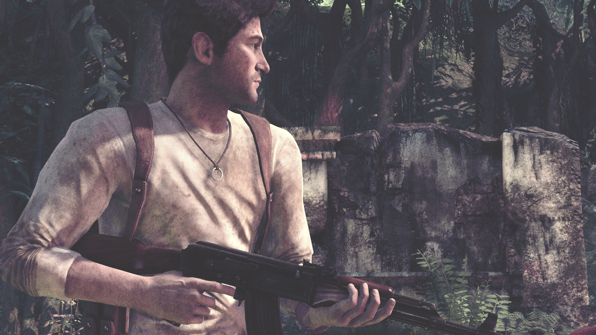
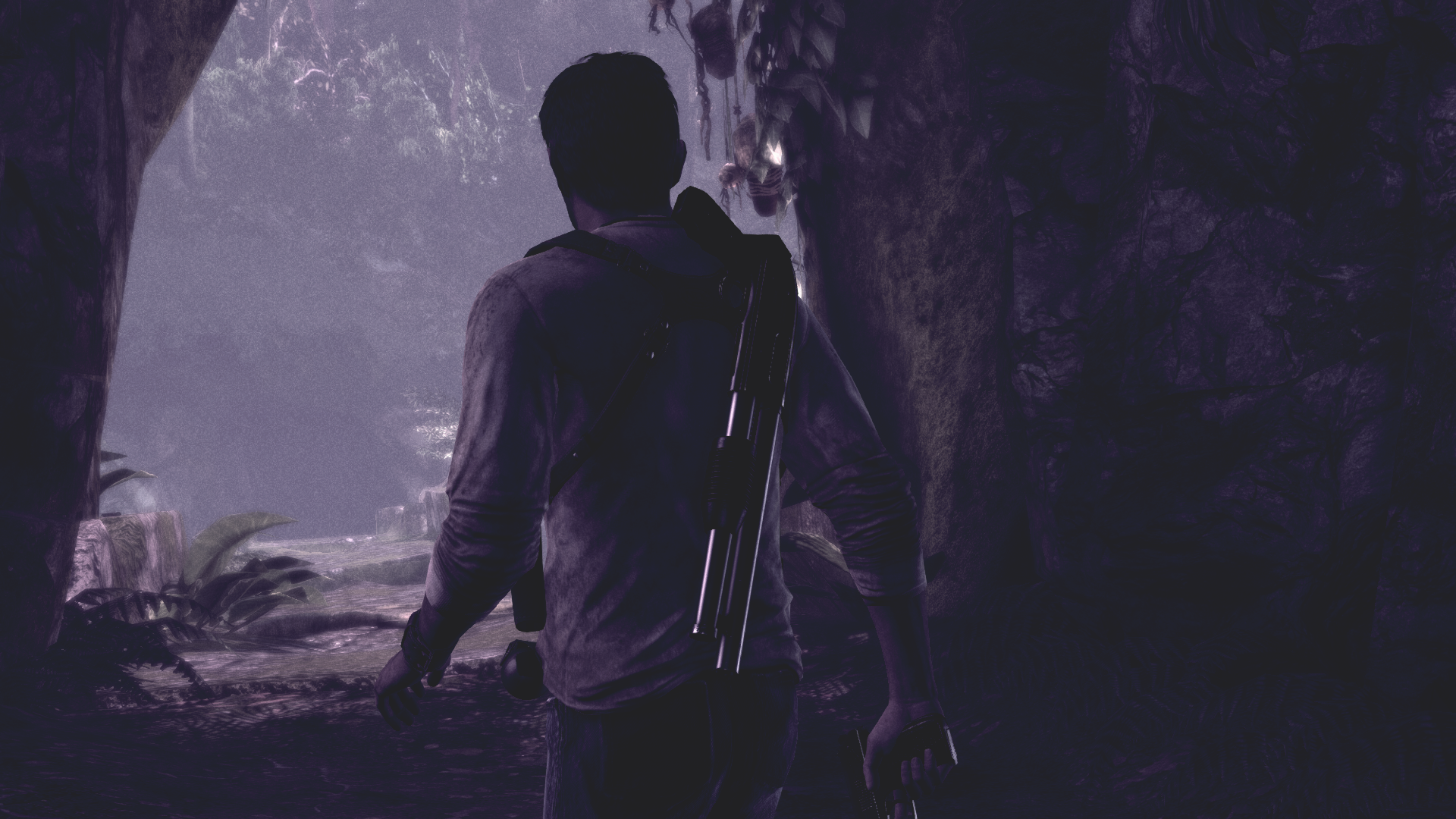
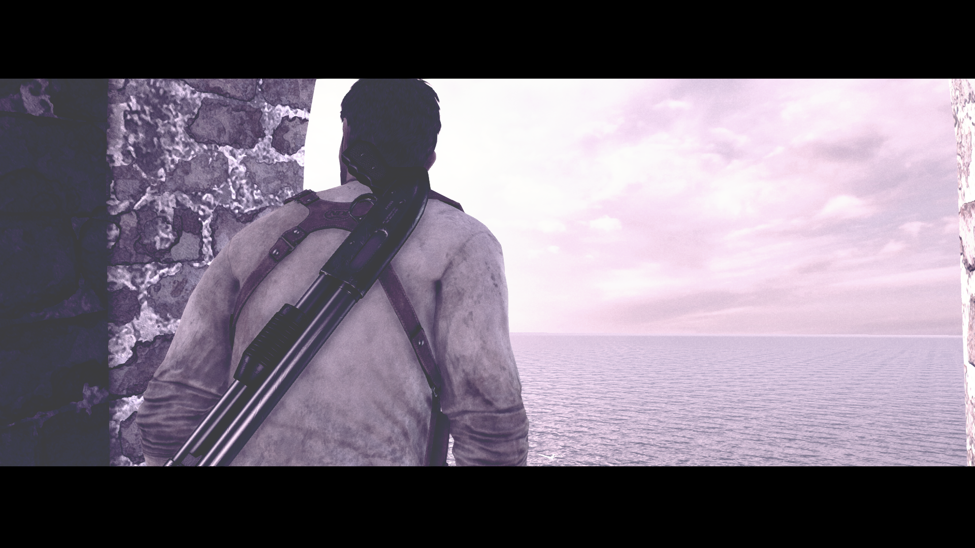
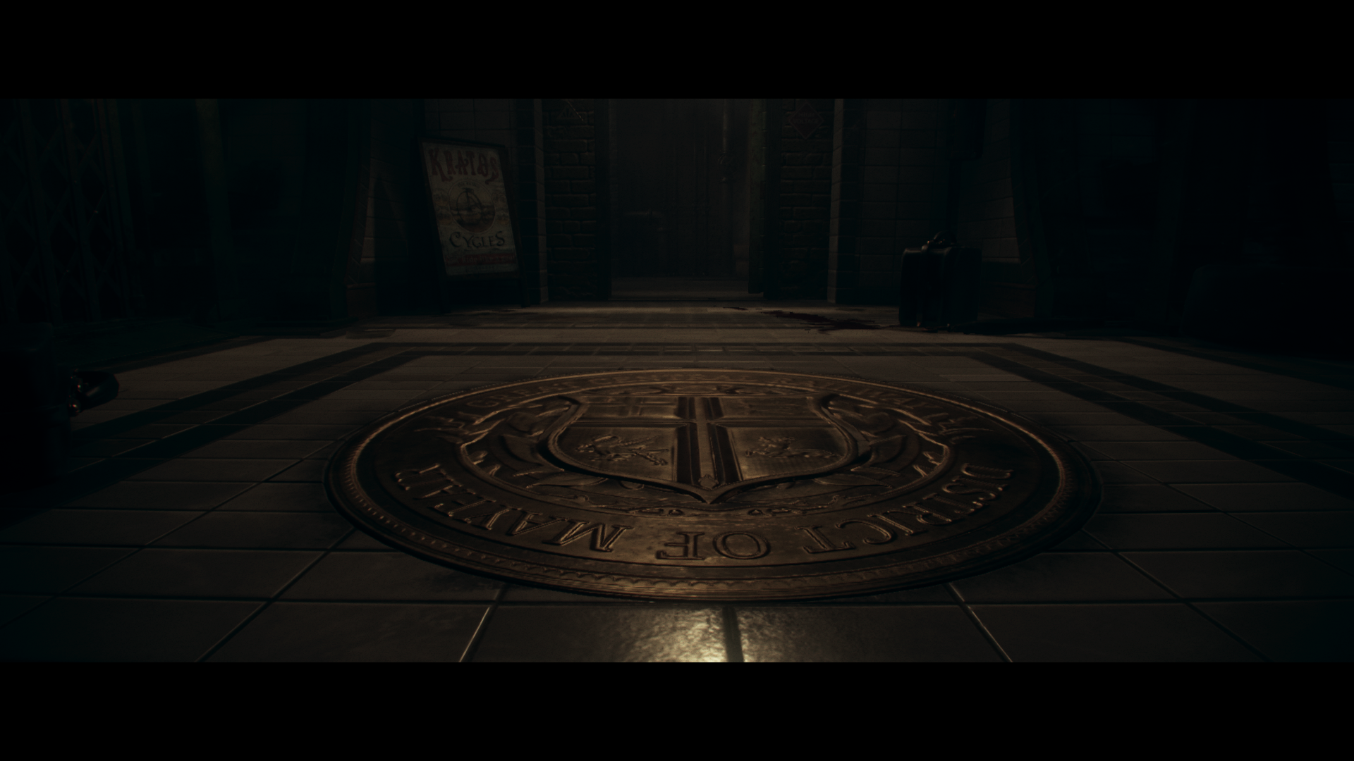
That is an in-engine cutscene.
I'm not the biggest fan of CA either, but I find it accentuates the dark/gloomy horrific look of bloodborne quite allright, perhaps they went a tad too heavy, but I'm finding it adds some definition to the scene in that game, if it was a more bright and sunny game my opinion would definitely have been the opposite, but I'm finding the PNG's brings out the beauty of the game even more.
I'm not the biggest fan of CA either, but I find it accentuates the dark/gloomy horrific look of bloodborne quite allright, perhaps they went a tad too heavy, but I'm finding it adds some definition to the scene in that game, if it was a more bright and sunny game my opinion would definitely have been the opposite, but I'm finding the PNG's brings out the beauty of the game even more.


CA as a default screen effect in any game is disgusting.The CA in Bloodborne is disgusting.