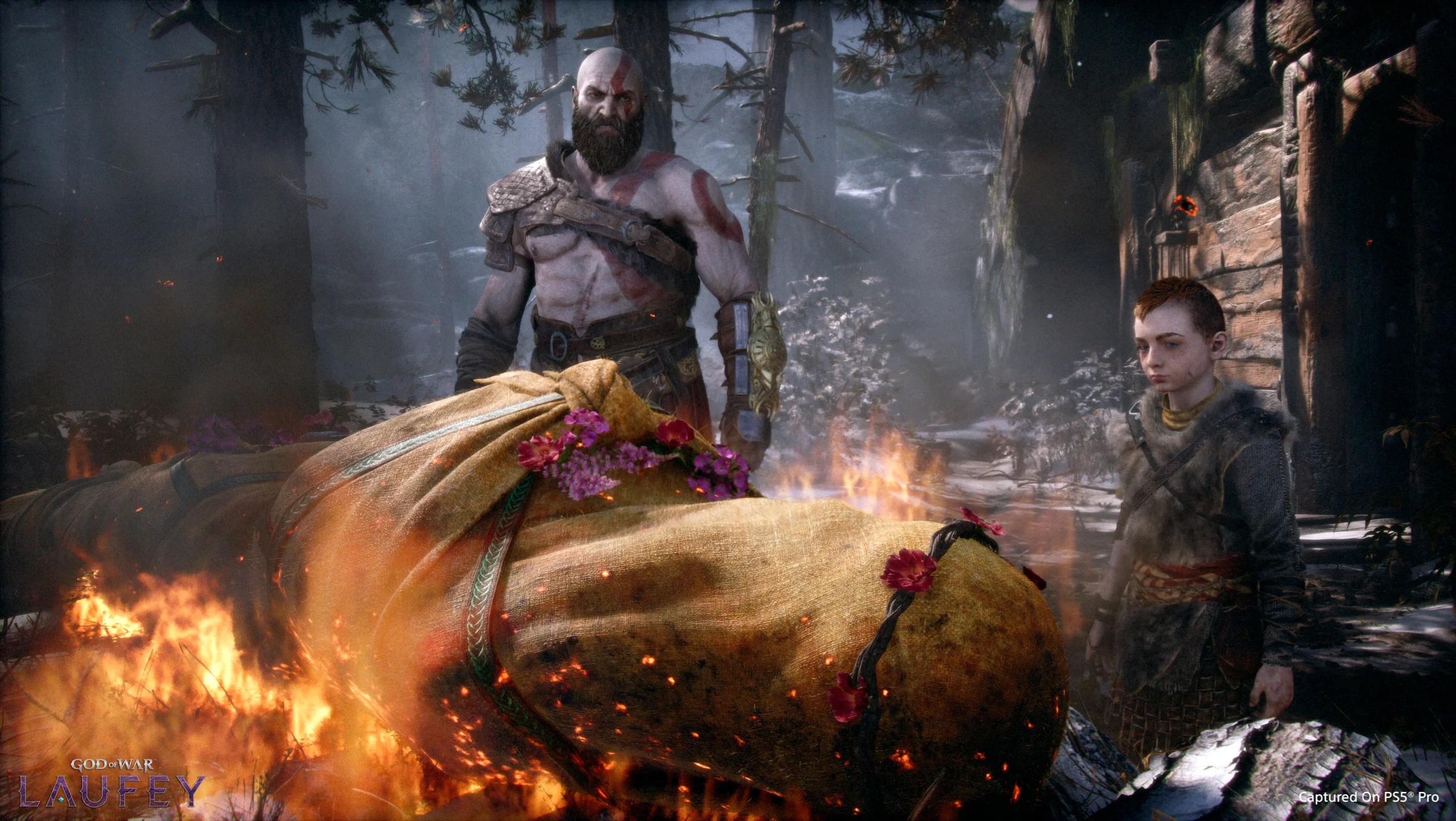
• Hey Guest. Check out your NeoGAF Wrapped 2025 results here!

Graphical Fidelity I Expect This Gen

ReoMu0OdXDQ06VLv.jpg


Less ugly than in the leak?
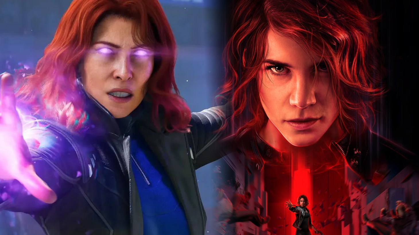
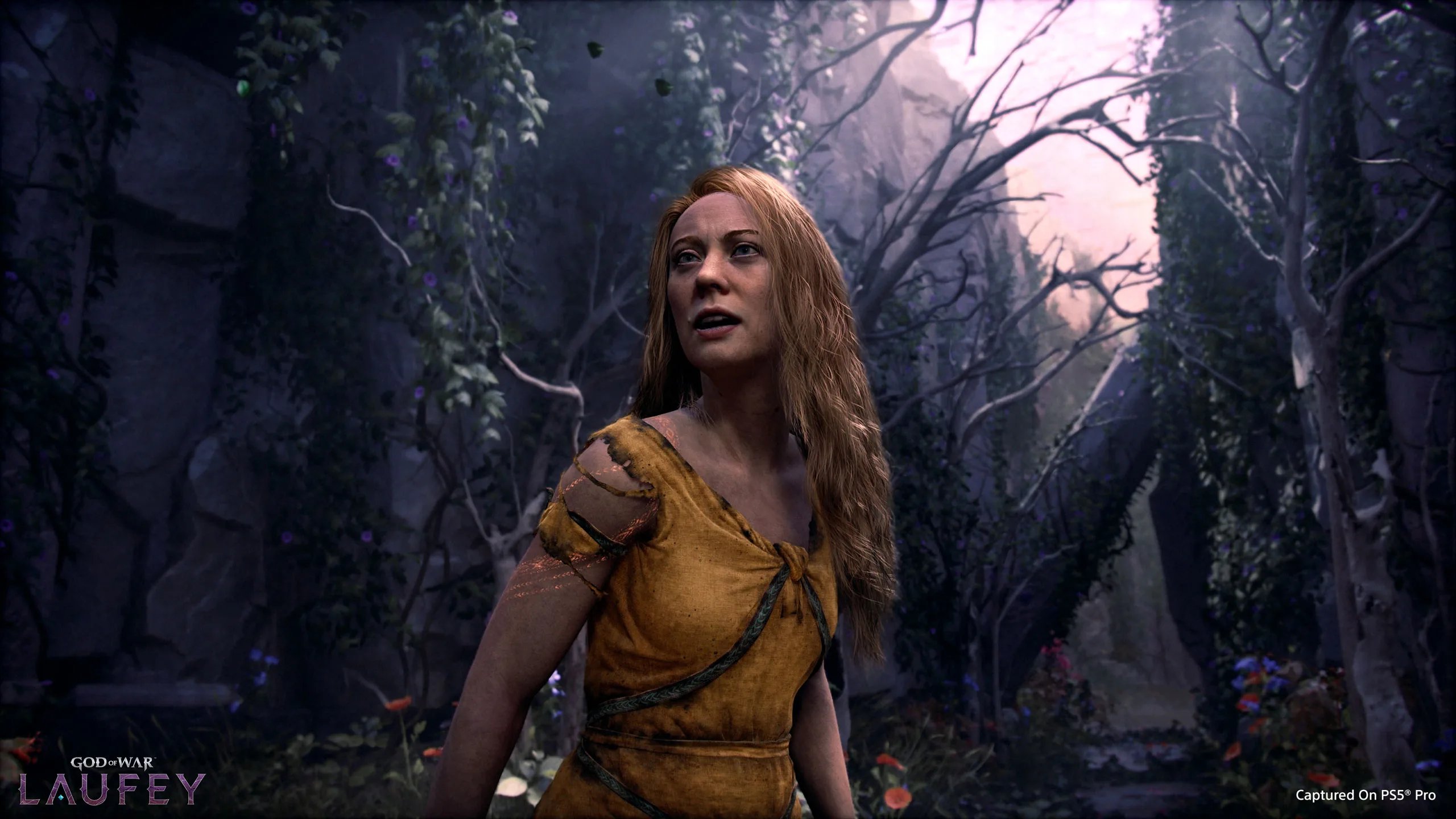
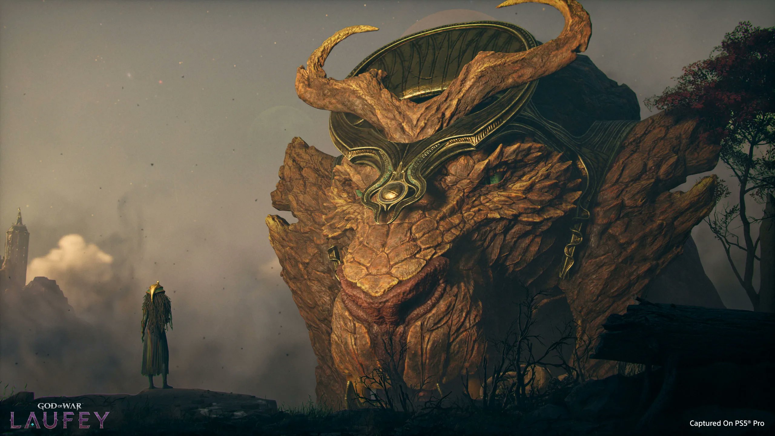
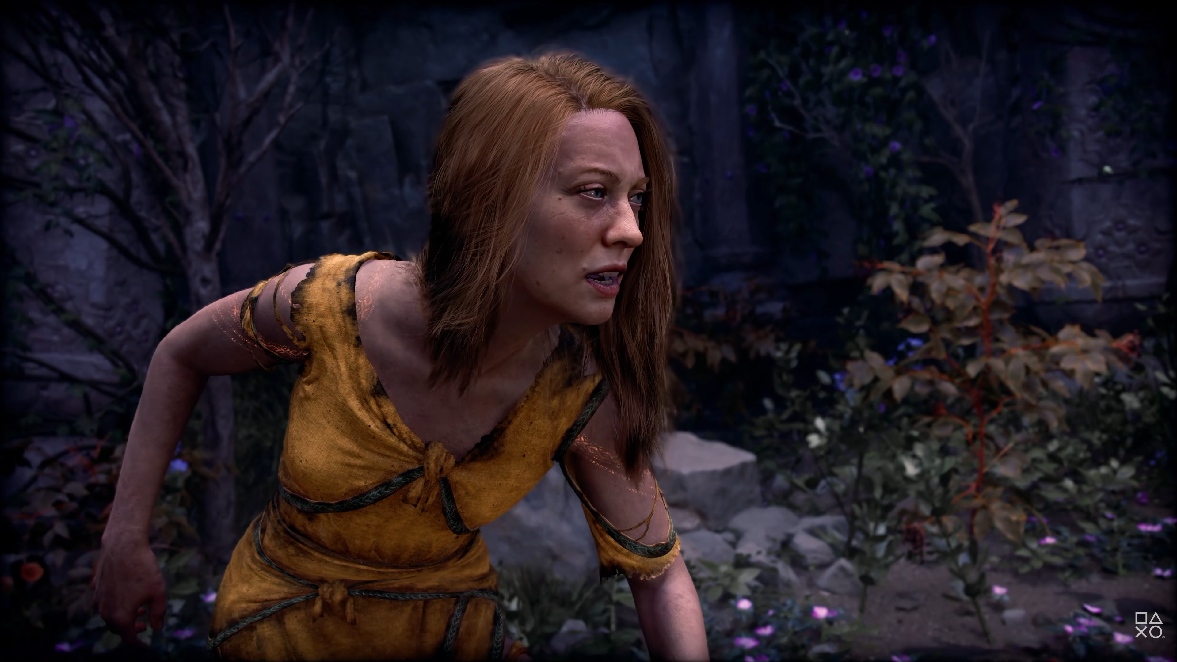
Ressemblance with the control lady in this pic is uncanny?
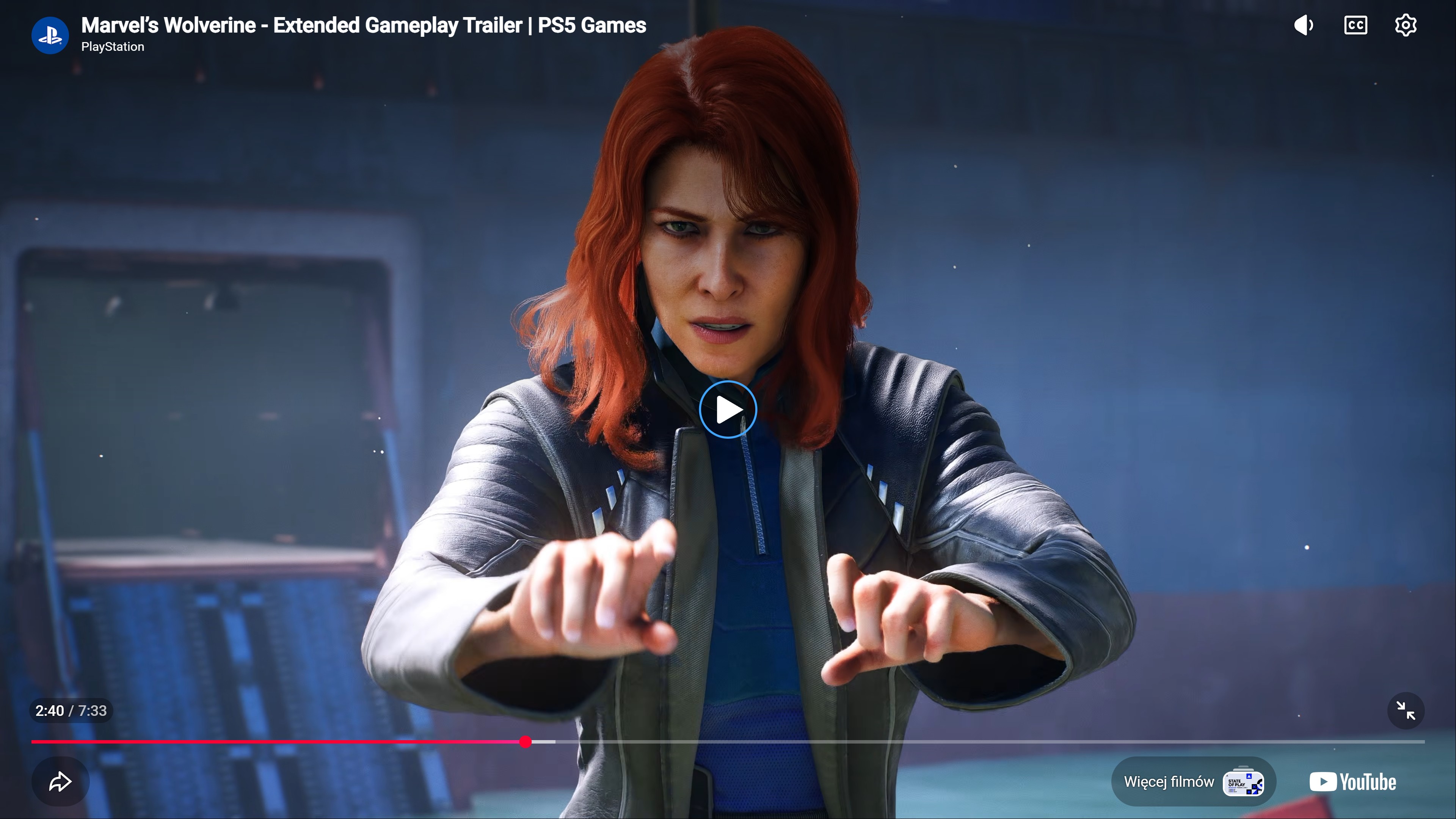
She looked old in the trailer, like post menopausal.
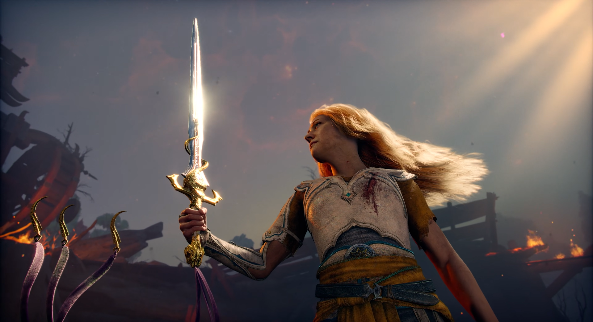
My guess is between her and Faye (who looks tremendously better), old boss lady is the new black for sony suits.
Stunning.

At least on a phone screen.
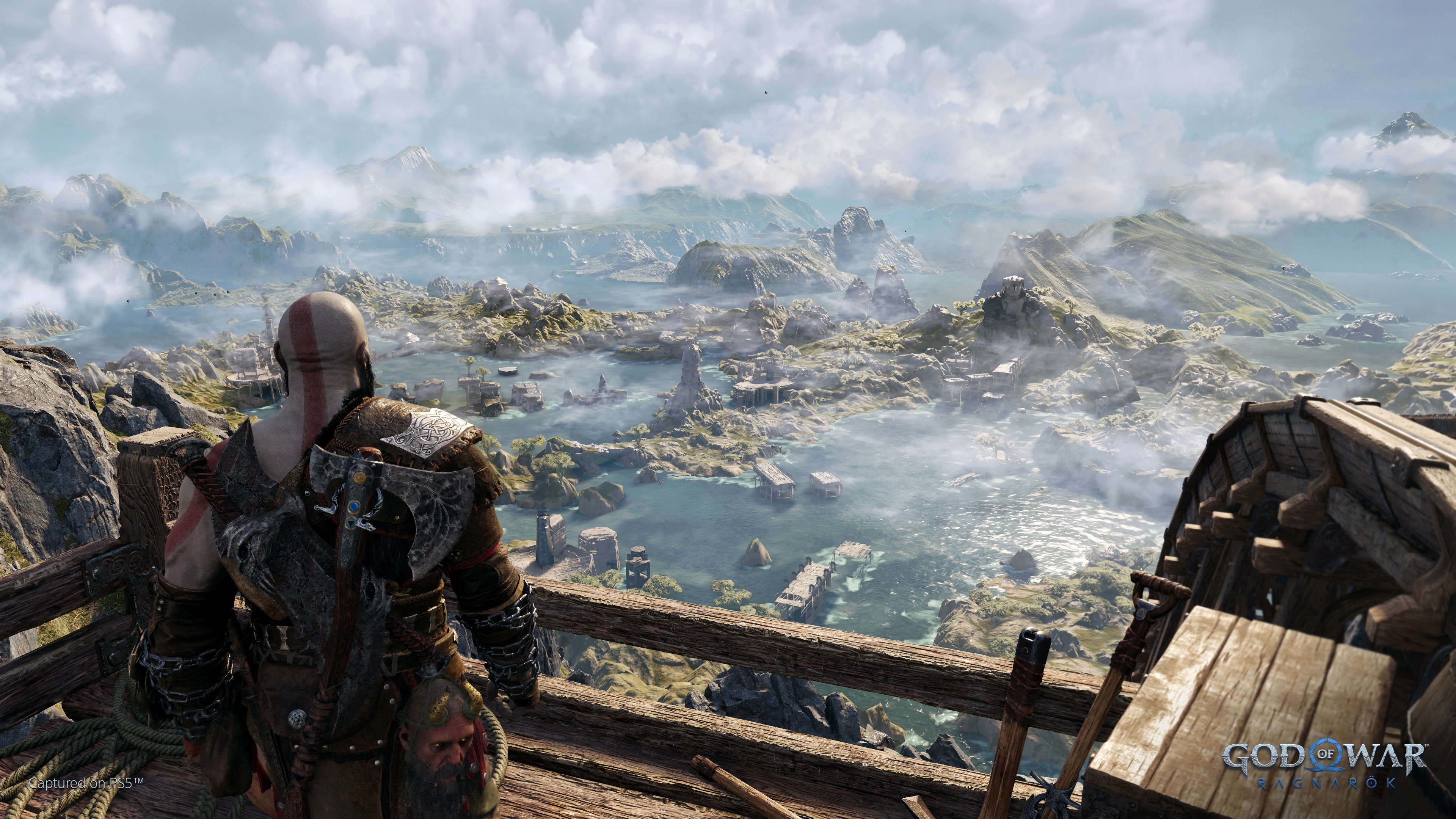
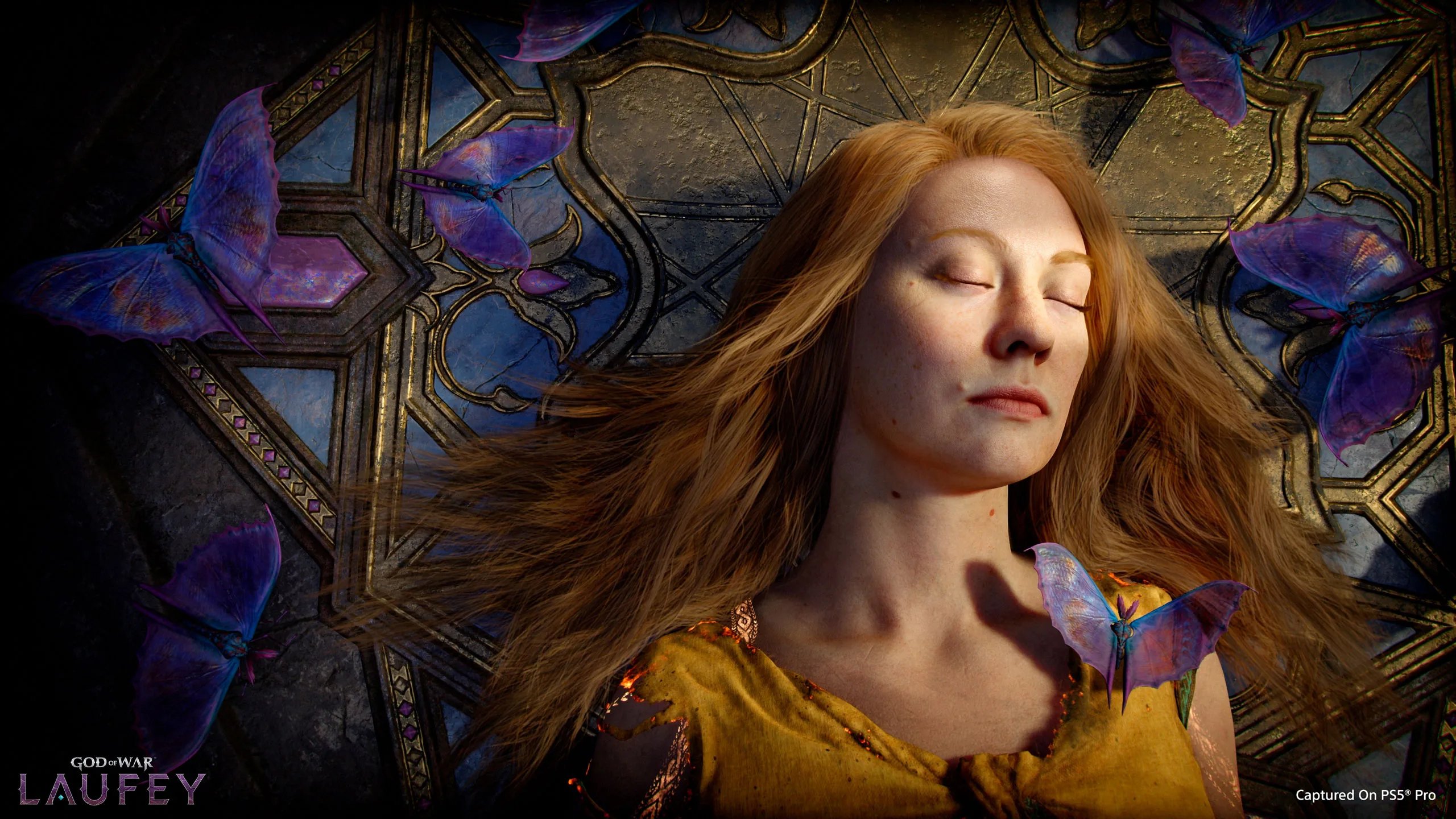
Watch it on a bigger screen and you'll see it is brave too :messenger_tears_of_joy:

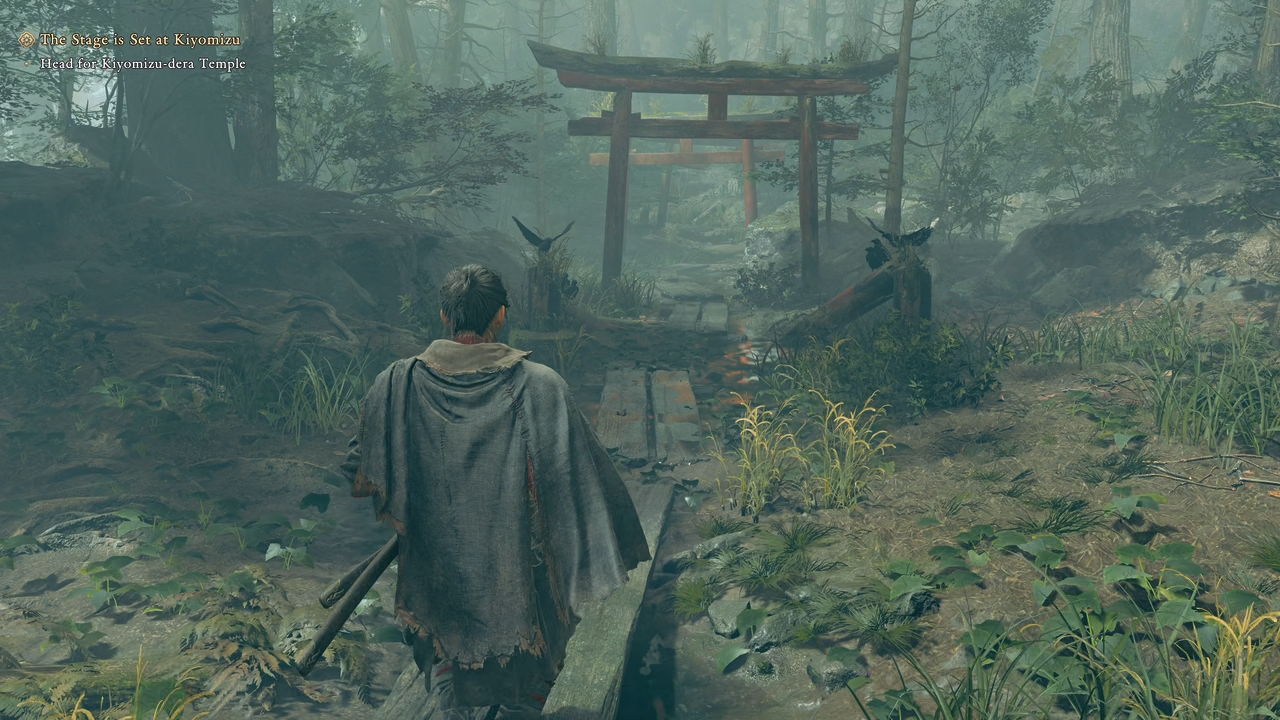
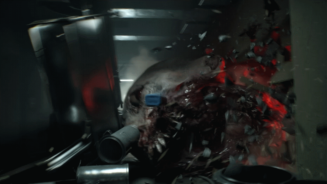
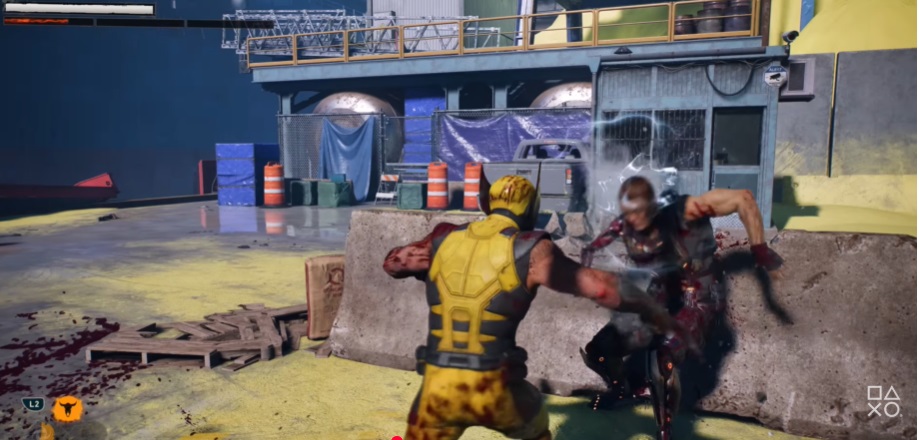
About Wolverine, everyone already said how underwehlming it looked, but there is one thing that i found well made, the destruction of the concrete bareers during the first fight. When logan throw ennemies onto it it breaks apart slightly. It is well made, and i wonder if you can fully break apart those type of obstacle, little by little.
0xnhr6i5WcFfDOll.jpg


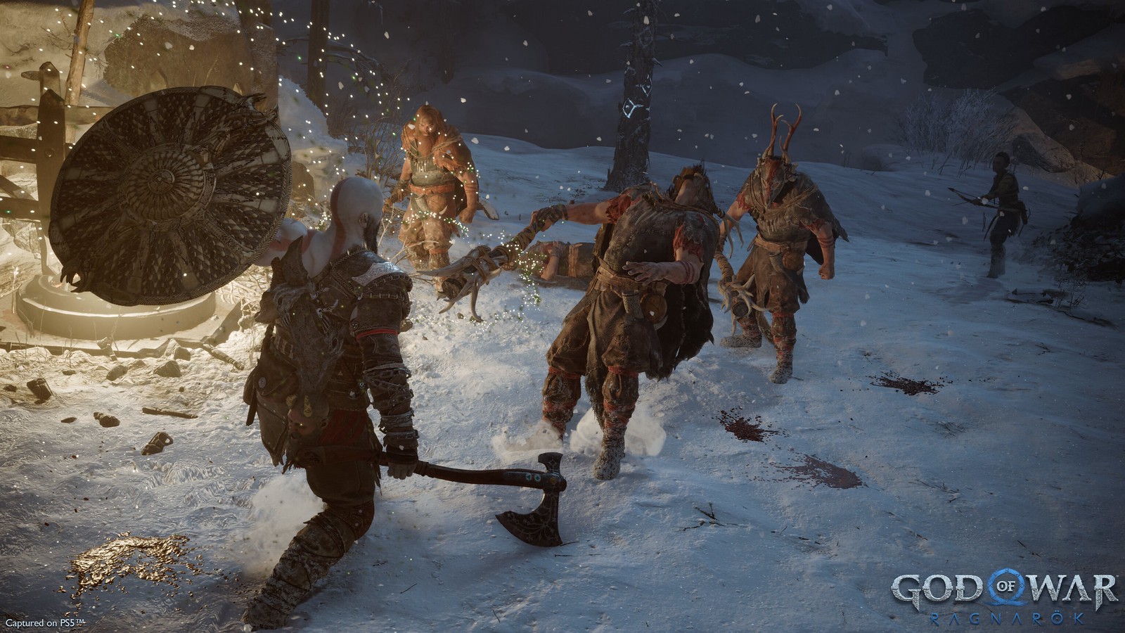
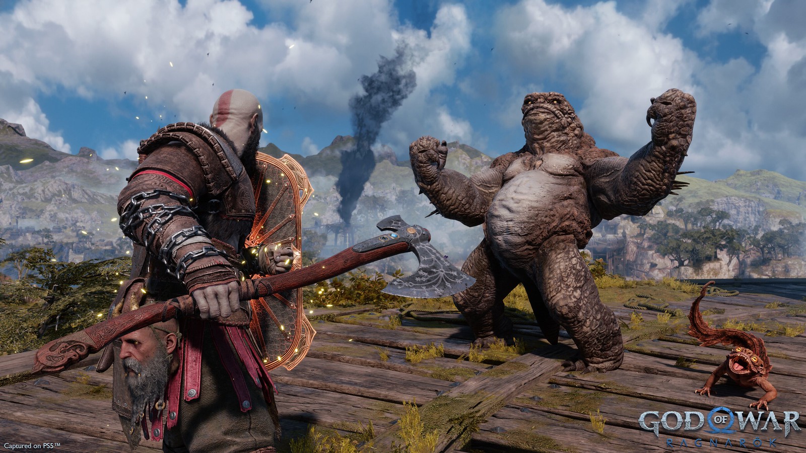
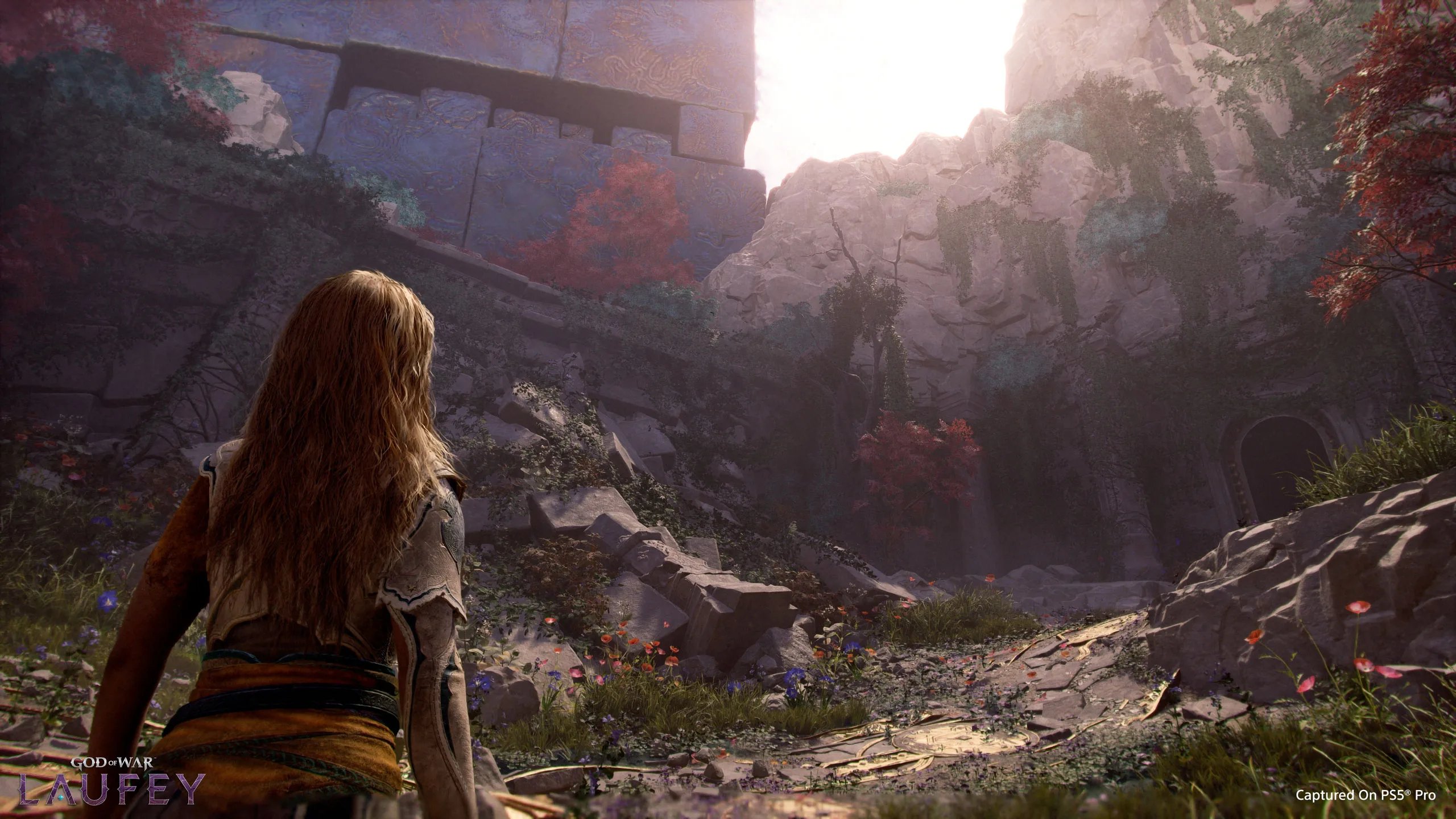
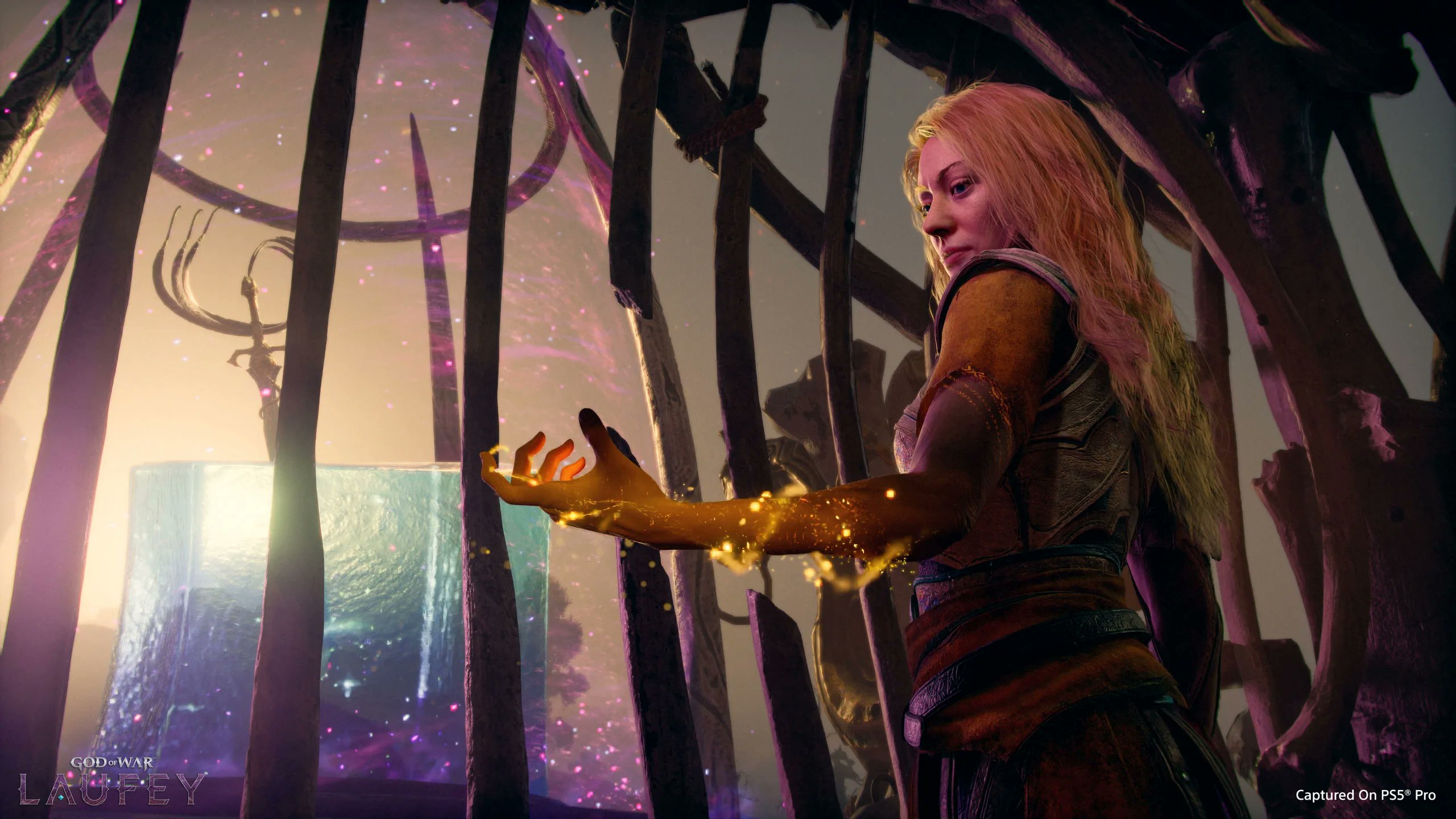
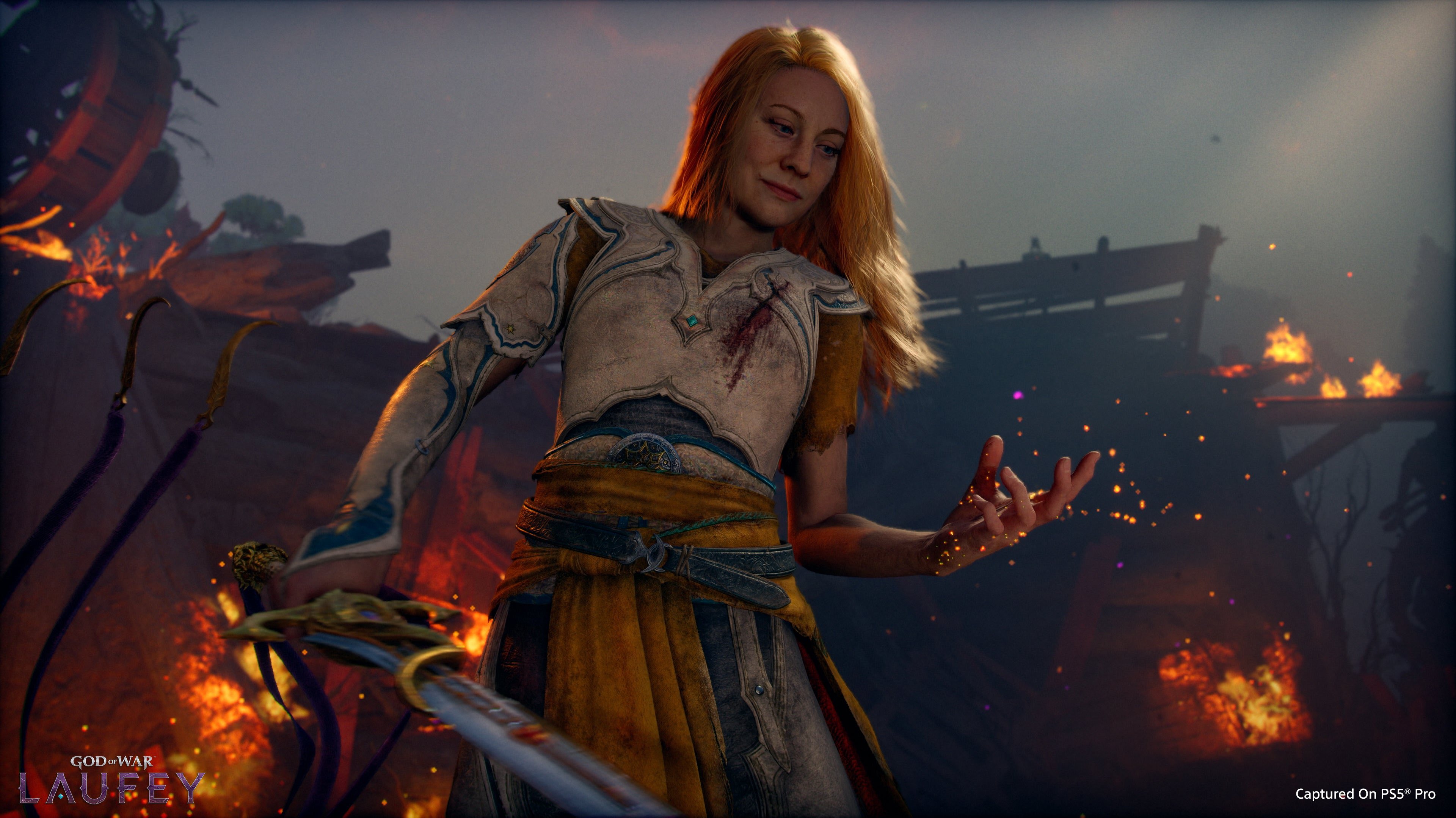
GOW Faye looks like hellblade with good gameplay so better than ragnarok, even tho not much.
 
It's interesting how RE Engine sucks when the areas and interactions get a bit bigger. Onimusha looks like it jumped straight out of the PS4 generation, I remember this IP looking strong during the PS2 era. My another visual disappointment after Laufey.
 
Last edited:
Dunno why you guys are so surprised that all these upcoming PS5 exclusive games look about the same as their PS4+PS5 crossplatform predecessors.
PS5 versions of these have already implemented everything they could while targeting 2x of FPS on PS5.
Wolverine have obvious RT reflections, ported over from SM2 (and SM1 on PC prior to that).
Laufey looks about the same as Ragnarok, and since they've already been at 1440p/60 there isn't much they can add aside from providing a 1440p/30 with some RT reflections probably.
The only way for these to improve significantly is to drop the 60 FPS targets completely. None of them are doing it.
 
It's interesting how RE Engine sucks when the areas and interactions get a bit bigger. Onimusha looks like it jumped straight out of the PS4 generation, I remember this IP looking strong during the PS2 era. My another visual disappointment after Laufey.
Agreed, it looks "From-Software"-Levels of ancient.
I also doubt that this will get any beautification on PC since we`ve really only seen bog standard baked lighting and very mediocre-assets/models so far, so there isn`t much there that you actually could scale up on higher performance machines.
 
Wolverine have obvious RT reflections, ported over from SM2 (and SM1 on PC prior to that).
Am i the only one who noticed that the reflections look really off, like at first i thought it was cubemabs in places but i think it's just that they are tracing against much lower detail models all while leaving out some objects completely.
The reflections just don't match up nicely like say in Cyberpunk with RT.
 
That is because it is a linear walking simulator. Extremely dumb to compare
compared to the almost linear environments we`ve seen from Wolverine so far....which is also officially confirmed to be linear throughout and not open world

......
Sure Jan GIF


Also you don`t know what a "walking simulator" is.......Or you have to put most, if not all horror fps of the last decade in that category including anything RE ofc.

"extremely dumb"
agreed.....
 
Last edited:
Just watched the state of play
Insomniac has fallen off : wtf is that ass looking wolverine? Looks worse than spiderman 2.
Until dawn 2 looks decent but nothing crazy.
God of cube : looks decent but the lighting STILL looks last gen ffs. You can tell the game has a huge budget though but for god's sake, give me angry kratos in Egypt.
 
Last edited:
That is because it is a linear walking simulator. Extremely dumb to compare
That wolverine gameplay section looks really shit even when compared to other cross gen sony titles and many parts from it looks really ps4 quality, I still don't got how they show that specific section when they have other sections with far better graphics like first trailer and last minute of this trailer
 
Am i the only one who noticed that the reflections look really off, like at first i thought it was cubemabs in places but i think it's just that they are tracing against much lower detail models all while leaving out some objects completely.
The reflections just don't match up nicely like say in Cyberpunk with RT.
Yeah, the BVH world is simplified and the shading is also simplistic. But that's what you get when you try hit 60 on these RDNA2 consoles from 2020.
 
Yeah, the BVH world is simplified and the shading is also simplistic. But that's what you get when you try hit 60 on these RDNA2 consoles from 2020.

But this is from PS5 pro with RDNA4 RT acceleration. They could have used much better BVH, I get why it's so simple for open world spider man but this game is linear.

Dude. Come on. Laufey is miles ahead of Ragnarok. Every single aspect - model and texture assets, density, lighting, that hair... This is a big jump.

we need more high quality Ragnarok pics here, people forgot how this game looks.
 
compared to the almost linear environments we`ve seen from Wolverine so far....which is also officially confirmed to be linear throughout and not open world

......
Sure Jan GIF


Also you don`t know what a "walking simulator" is.......Or you have to put most, if not all horror fps of the last decade in that category including anything RE ofc.

"extremely dumb"
agreed.....
Wolverine is open hub/zone. Not linear. That ill game will be walking cooridor to cooridor with one or two enemies on screen, at most. It will be Hellblade 2.0 all over again

And I doubt it will look close to that good because that Russian studio is known for making games look WAY better in trailers than the actual game. It is the same people behind Atomic Heart. They also simultaneously developing The Cube, which looks way too good to be true

 
Last edited:
tHHdJaSDCM35JHER.gif


Onimusha looks pretty poor. After Wukong, there is a higher bar for these sort of games. The combat and performance is great however.
Likely a skip for me.

I agree on the visuals. RE Engine games are clearly best for small interiors/urban environments. They always struggling with larger environments/forests/foliage/etc..


Onimusha isn't anything like Wukong though.
 
Last edited:
ILL was the only title last night that made me go, "wow". Wolverine looks and feels like SM2 (same universe so I guess), too clean and sterile-looking. GOW Laufey looks better than the incredibly safe-looking Ragnarok, especially in the facial animations, but I still wasn't impressed. The gameplay especially looked floaty.

I feel like E-Day is going to absolutely blow the doors off all that was shown today, outside of ILL. UE5+ The Coalition = What will likely be a new graphical standard, alongside Hellblade 2.
 
To end this here ragnarok Gameplay playstation blog first official pics:
pbDGqSbXFI1fIJF9.jpg
c9ALWu5Bk7VfLJYP.jpg
bITJMVMb6RokdldW.jpg
iTOV1PkoyvtlhCCQ.jpg
42tc1ve9ugIBWzIh.jpg
PeZlBKClWjakIzcF.jpg
QQy38M9XEsadN31W.jpg
E9qcob0zE3dlYqoS.jpg
QEIx9xTKwLTy4Z6T.jpg
qlWZ0uZFe4XgZR7l.jpg

fmEhFNxEdwM2Q5ch.jpg
ZQMPEUYipwSWIvnE.jpg
jb7VvPoAo8Qx6GyE.jpg
hPFwxx9cmJ6y5pht.jpg


Faye Playstation blog first official gameplay pics

Ax6DjfRfFSaddFCM.png

LHetYxwO28Ud2xe6.jpg
ocMTXVCcq6Yfc2mw.jpg
ZaWPE4cZyg8Rp3fb.jpg
XLGTBZmHAUhrl4RD.jpg
A8w4cBv2MwI3sq3b.jpg
VrQui2Xnb6Rr0wDI.jpg

y8GOrYpMEjqx0oV5.jpg
GNn8g4fubmLv7MlW.jpg


I think that is fair enough, I will leave the comparison to you guy's
 
Last edited:
Thoughts?

4DOcDCJ.gif


i think the demo is lacking some post processing effects and volumetrics that makes it look really bland. but there are several good looking shots in the trailer.
 
I just booted up Ragnarok last night on my PS5 Pro. It looks way worse than Faye. Lighting is way worse, character models look way worse, her hair looks 2 gens behind.

Thoughts?

4DOcDCJ.gif


i think the demo is lacking some post processing effects and volumetrics that makes it look really bland. but there are several good looking shots in the trailer.
This looks good, game will look good enough. I dont care, September is loaded and all of these games are an appetite before GTA6 anyway.
 
I just booted up Ragnarok last night on my PS5 Pro. It looks way worse than Faye. Lighting is way worse, character models look way worse, her hair looks 2 gens behind.


This looks good, game will look good enough. I dont care, September is loaded and all of these games are an appetite before GTA6 anyway.
I think the pics above is fair enough to show the difference
 
I don't see any RTGI here (or any RT) - if there is one, it's probably on ghost of yotei "quality" settings.

Not comparable to the barebones Yotei implementation at all. We've got accurate/RT emissive lighting throughout the environment, superb self shadowing on main character Faye that we've never seen before in God of War. Indirect lighting is a generational improvement over Ragnarok across the board.
 
Thoughts?

4DOcDCJ.gif


i think the demo is lacking some post processing effects and volumetrics that makes it look really bland. but there are several good looking shots in the trailer.

Looks pretty flat - I don't think Wolverine looks very good right now. It's possible and even likely that it will improve by release given Insomniac track record but there are also non graphical aspects of the game that turn me off such as the writing/dialogue.
 
To end this here ragnarok Gameplay playstation blog first official pics:
pbDGqSbXFI1fIJF9.jpg
c9ALWu5Bk7VfLJYP.jpg
bITJMVMb6RokdldW.jpg
iTOV1PkoyvtlhCCQ.jpg
42tc1ve9ugIBWzIh.jpg
PeZlBKClWjakIzcF.jpg
QQy38M9XEsadN31W.jpg
E9qcob0zE3dlYqoS.jpg
QEIx9xTKwLTy4Z6T.jpg
qlWZ0uZFe4XgZR7l.jpg

fmEhFNxEdwM2Q5ch.jpg
ZQMPEUYipwSWIvnE.jpg
jb7VvPoAo8Qx6GyE.jpg
hPFwxx9cmJ6y5pht.jpg


Faye Playstation blog first official gameplay pics

Ax6DjfRfFSaddFCM.png

LHetYxwO28Ud2xe6.jpg
ocMTXVCcq6Yfc2mw.jpg
ZaWPE4cZyg8Rp3fb.jpg
XLGTBZmHAUhrl4RD.jpg
A8w4cBv2MwI3sq3b.jpg
VrQui2Xnb6Rr0wDI.jpg

y8GOrYpMEjqx0oV5.jpg
GNn8g4fubmLv7MlW.jpg


I think that is fair enough, I will leave the comparison to you guy's

Yeah, it's in the same ballpark, it could be sold as expansion pack/DLC.

Not comparable to the barebones Yotei implementation at all. We've got accurate/RT emissive lighting throughout the environment, superb self shadowing on main character Faye that we've never seen before in God of War. Indirect lighting is a generational improvement over Ragnarok across the board.

I think you need to post examples of that. I don't see it, we have standard cascade shadow maps, baked lighting and in this pic - no good lighting at all (also no SSS):

RLqxdHVtwVcvMGk9.jpg
ijNHf8Vp49DAtGI1.jpg


To me it just look like standard raster tricks but of course I could be wrong.
 
Wrt Laufey the armour and skin textures of the two villains and the big flying dragon-like creature looked impressive but the lighting looks dated to me. Fey's face often looked poorly lit.
 
Looks pretty flat - I don't think Wolverine looks very good right now. It's possible and even likely that it will improve by release given Insomniac track record but there are also non graphical aspects of the game that turn me off such as the writing/dialogue.
What writing and dialogue have been shown to be a turn off? So many people go into games just hating them
 
Top Bottom