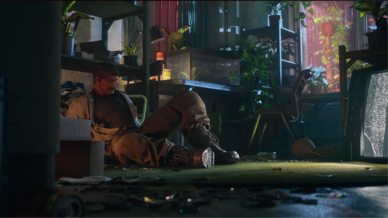
It's not just color, though it may play a part. Assets, art direction and GI settings are inadequate in this game. All the tech is in there, but if the assets aren't up to current gen standards, looking drab or don't respond to light well, everything starts looking flat.
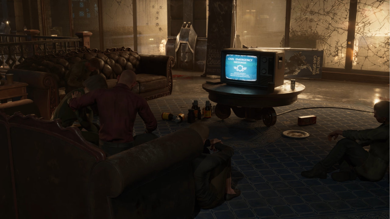
Why is the empty couch on the left so flatly lit that it looks to be floating? Why is there no ambient occlusion at all right under the TV stand, but only shadows in front of it, even though the light source behind is placed higher than the TV? The megalights soft shadows looks nice, but that's different from AO. And what is even going on with the soda can next to the TV and the inverted triangle of a shadow or reflection under it? It looks like it's spinning on a pointy edge. Why is the TV's glow so faint, when it could be hitting the people in front of it at no performance cost with megalights? Why are the two people on the right lit differently from the rug they are sitting on? Why are clothes, skin and the rugs not responding to light in any way with any specular highlights or SSS. Why is neither the standing nor the fallen signage behind the TV having
any specular detail, given the glossy floor and a reasonable amount of light? That material is probably glossy too, but it looks matte. If so, then what material is it? Could be paper, cloth, plastic... no way to tell. Why does the side table on the left (wood) not look all that different from the cushion of the couch (leather)? And if all this looks a lot better from the opposite direction, where most of the light originates, then why even frame this shot in such an unflattering angle on your first big reveal?
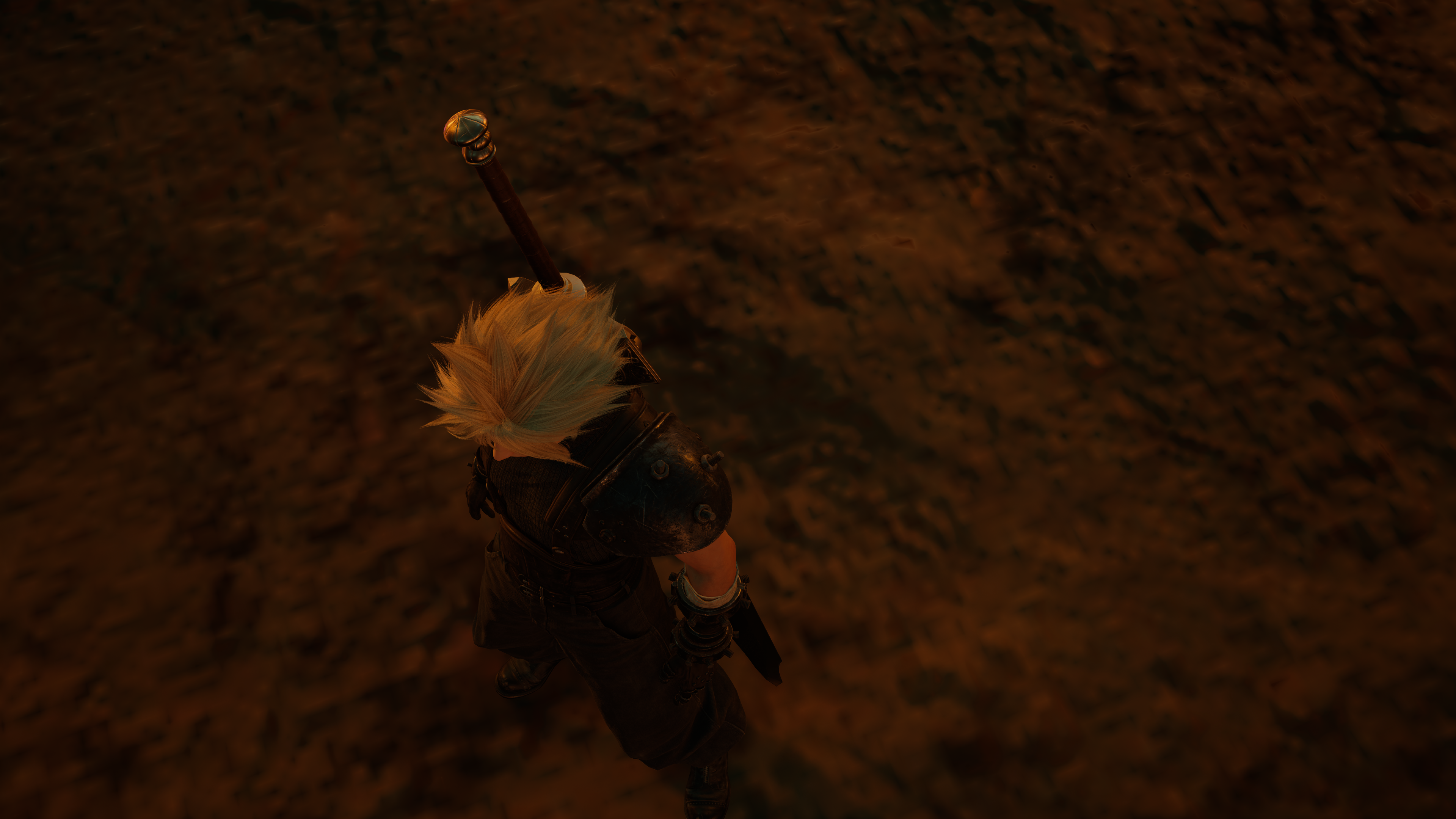
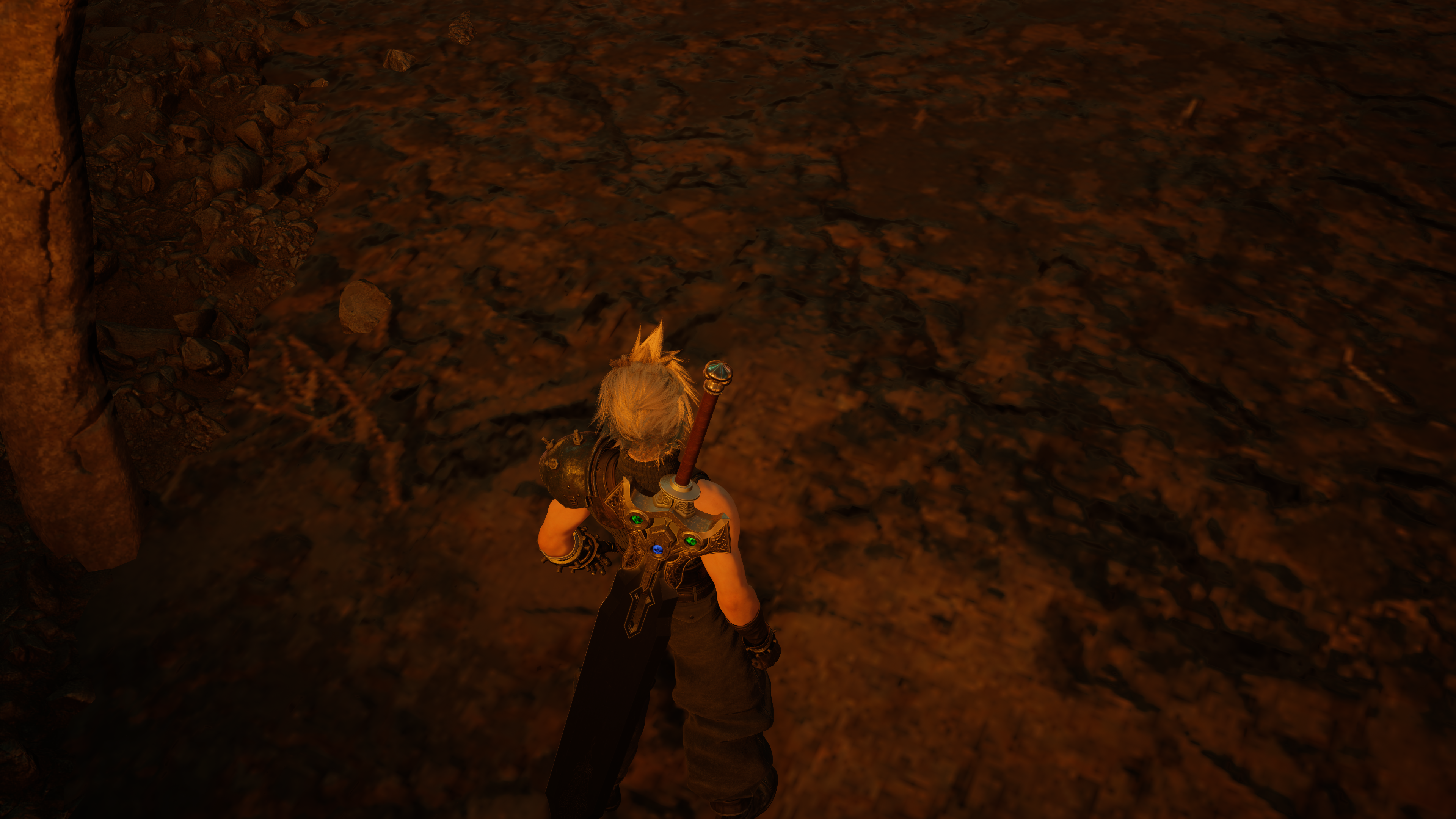
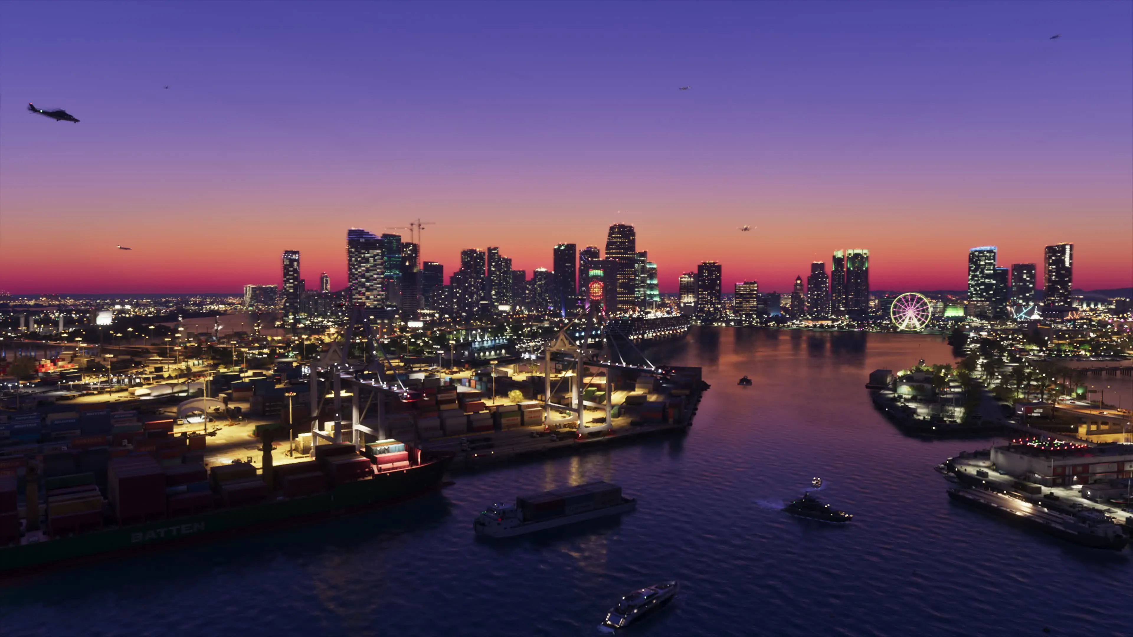
Now compare that with this:
Sure, it's more colorful, but all the materials and lighting look and behave as they should.
Everything in the frame tells a story, including the light. That's better art direction on top of everything else that is just technically better. Which is all a bit confusing as the underlying tech is quite literally the same.