-
Hey, guest user. Hope you're enjoying NeoGAF! Have you considered registering for an account? Come join us and add your take to the daily discourse.
You are using an out of date browser. It may not display this or other websites correctly.
You should upgrade or use an alternative browser.
You should upgrade or use an alternative browser.
Code Name S.T.E.A.M. (IntSys 3DS) Assets (Box, Screens)
- Thread starter Hero of Legend
- Start date
CharminUltra
Member
As someone who likes Kirby art (I'm not a huge diehard fan that has read all his titles, I just like his art and I'm familiar with it), this doesn't really look that much like Kirby art at all outside of the poses (and the foreshortening it creates) and the ink dot shading effect. This reminds me more of Elite Beat Agents or Ouendan than silver age comics.
Either way, I'm still excited. Gameplay sounds sublime on paper, now I just want to see it in action.
Either way, I'm still excited. Gameplay sounds sublime on paper, now I just want to see it in action.
I love the way the game sounds, but Jesus is it hideous. It not only has a horrible artstyle that looks like a cheap kids cartoon but the graphics also look like something you'd expect from a tie in with a kids cartoon. I hope they hear the criticism of the art and change it because this game is so ugly it's almost offensive.
How is it offensive..?
the reason why it looks like a tie in with a Saturday morning cartoon type thing is because.. that's the point. I get not liking it but they didn't fail at what they're going for.
the whole description and tone of the game gives sense to these types of square jaw cartoon/comic guys
they're clearly going for that
I do feel like it has been done before tho, specially on mobile and whatnot, which can cheapen it.
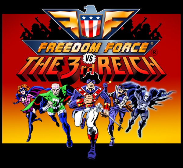
it makes me think of freedom force and that's good
I think a lot of people are going to end up making a 180 on this and end up liking the art style. The Kirby dots look so good.
This game could look like an amiga game and I'd still be sold.
.................
........................................
...........................................................
Uhhhhhhhhhhhhhhhhh. Talk about disappointment. No wonder they talked about it before showing it. The art style and everything else looks like the epitome of boring and repulsive. To me at least. Whats up with the Gears of War look-a-like protagonist? No Nintendo, just no.
Probably depends on in-game performance. I'm not particularly fond of it myself, but no sense in letting an art style I don't care for blocking me from playing a game I'd like, so long as it's not actively hideous at least (which this isn't.)I think a lot of people are going to end up making a 180 on this and end up liking the art style. The Kirby dots look so good.
JasonUresti
Member
I think the art looks good, once you notice the Kirby dots (as in, the dot-pattern-based style of the legendary Jack Kirby). The dots really tie together the art design nicely. I also like the retro color scheme they're using here.
I also have a feeling that the sharply-delineated shadows will look really nice in-game and in stereo 3D.
The dots are not a signature Kirby element, it was due to the coloring process for comics at the time.
ArchedThunder
Banned
I think a lot of people are going to end up making a 180 on this and end up liking the art style. The Kirby dots look so good.
No, I don't think so, this is one of the worst looking games(from a visual stand point) I've ever seen. It is hideous, no exaggeration. Kirby dots on shit doesn't make it look good, it's still shit. The game also doesn't have the dots btw.
Boss Doggie
all my loli wolf companions are so moe
Yeah, it's not doing well with that cover.
The cover look is tiny. Look for the big sized one. It's beautiful.
Something about the art makes me think of a knockoff JJBA... interested to see the Treehouse stuff tomorrow.
What's the american version for GOGOGOGOGOGO/menaching sfx
I love the way the game sounds, but Jesus is it hideous. It not only has a horrible artstyle that looks like a cheap kids cartoon but the graphics also look like something you'd expect from a tie in with a kids cartoon. I hope they hear the criticism of the art and change it because this game is so ugly it's almost offensive.
Hah, cheap cartoons DREAM to look like something from the cover.
As for the screenies, well... handheld game.
Really, it seems like people expected anime aesthetics due to the genre even though it's explained that it's more American.

personally, i do not like the artstyle that much, but it's not bad, it's very fitting with the american super hero theme they have going
graphically speaking, it looks pretty good, fits the artsytle
is everyone buttmad because they wanted anime art style because this is suppose to be a jrpg?
graphically speaking, it looks pretty good, fits the artsytle
is everyone buttmad because they wanted anime art style because this is suppose to be a jrpg?
ConradCervantes
Banned
Art looks like some turd from Zynga. I would literally kill myself if someone saw me playing this in public.
And Sticker Star sucked, although that was less of IntSys' fault than it was Miyamoto's.
And Sticker Star sucked, although that was less of IntSys' fault than it was Miyamoto's.
Scientist Supreme!
Banned
.................
........................................
...........................................................
Uhhhhhhhhhhhhhhhhh. Talk about disappointment. No wonder they talked about it before showing it. The art style and everything else looks like the epitome of boring and repulsive. To me at least. Whats up with the Gears of War look-a-like protagonist? No Nintendo, just no.
Wow. That it, Im done, this thread is just crazy.
It was a thousand times better in my head. Man, it looks totally different than I thought it would. I was expecting designs akin to valkyria chronicles lol. Rich, vibrant, colorful and a much larger scope. I'm still willing to give this game a shot because the gameplay sounds really interesting, but it's completely different than what I imagined it would look like.
ArchedThunder
Banned
The cover look is tiny. Look for the big sized one. It's beautiful.
What's the american version for GOGOGOGOGOGO/menaching sfx
Hah, cheap cartoons DREAM to look like something from the cover.
As for the screenies, well... handheld game.
Really, it seems like people expected anime aesthetics due to the genre even though it's explained that it's more American.
No, I expected something that looked like this.

Instead we got what looks like a mid 2000's cartoon that was made to sell toys that got canceled after a single season because no one liked it. They failed to do what they set out to do from an art style perspective.
If they were going for that it would be uniform. Rather it seems like a combination of the two: evoking the coloring process for comics at the time, arranged in patterns like the actual "Kirby dots," seen below. You can note this on the "shafts" of dots in select places on the cover.The dots are not a signature Kirby element, it was due to the coloring process for comics at the time.
Grenouille
Member
I can see the mignola and Kirby influence in that boxart now. If only they had gotten the faces right...
Yeah, that's how I feel too.No, I expected something that looked like this.
Instead we got what looks like a mid 2000's cartoon that was made to sell toys that got canceled after a single season because no one liked it. They failed to do what they set out to do from an art style perspective.
Boss Doggie
all my loli wolf companions are so moe
No, I expected something that looked like this.
Instead we got what looks like a mid 2000's cartoon that was made to sell toys that got canceled after a single season because no one liked it. They failed to do what they set out to do from an art style perspective.
Actually, with the way they explained, I expected more like this
And the cover shot pretty much made me think that
Art looks like some turd from Zynga. I would literally kill myself if someone saw me playing this in public.
And Sticker Star sucked, although that was less of IntSys' fault than it was Miyamoto's.
wut
Zinga has this "app art style" shit prevalent from mobile games. This ain't that.
Reserving final judgement for video gameplay footage (which will also help me understand what in the world is going on in the screens)
What does this mean?
The vita is stronger and is a lot more photogenic.
StreetsAhead
Member
Some people are being embarrassing with their hyperbole.
Muscle Wizard
Banned
We need more games styled after Jack Kirby works.
ArchedThunder
Banned
Actually, with the way they explained, I expected more like this
And the cover shot pretty much made me think that
And it still looks nothing like that, it looks like a Ben 10 era cartoon reject.
ArchedThunder
Banned
Some people are being embarrassing with their hyperbole.
I'm not being hyperbolic, I literally mean everything I've said. This game is hideous artistically and graphically.
Gonzo The Great
Banned
OMG IT'S NOT ANIME INSPIRED HOW REPULSIVE!
This looks really cool. I trust Intelligent Systems.
Boss Doggie
all my loli wolf companions are so moe
And it still looks nothing like that, it looks like a Ben 10 era cartoon reject.
wat
do you even know what Ben 10 looks like? It looks nothing like that.
Also forgetting the fact that Ben 10 has three different artstyles.
SirBukkake
Member
Damn... It almost looks like that style is by design.
"We'll take this IS developed action/srpg, with steampunk setting, mechanics similar to Valkyra Chronicles and possibly Xcom, and wacky plot... then coat that with a very out-of-left field aesthetic." Talk about testing gamer's Gameplay > Graphics philosophy, and putting our money where our mouths are.
...I'll take that bet though: Day 1.
Slightly peeved that they said their inspirations were Mike Mignola and Jack Kirby. I absolutely adore them and kinda sad that they didn't pick up on those artist's use of composition; everything feels so scattershot, design wise. Hope it looks good in motion.
guys
guys
this has the composer of:
Advance Wars
Fire Emblem
Paper Mario: The Thousand Year Door
I ain't gonna lie and say that that art style doesn't seem rough, but the amount of fucks I give right now are so few.
guys
this has the composer of:
Advance Wars
Fire Emblem
Paper Mario: The Thousand Year Door
I ain't gonna lie and say that that art style doesn't seem rough, but the amount of fucks I give right now are so few.
ArchedThunder
Banned
OMG IT'S NOT ANIME INSPIRED HOW REPULSIVE!
This looks really cool. I trust Intelligent Systems.
Or you know, it looks nothing like a silver age comic book like they said it would.
Booty Patrol
Banned
oh so that's the actual name of the game.
And it still looks nothing like that, it looks like a Ben 10 era cartoon reject.
I have watch a lot ben 10 and this looks noting like it.
And it still looks nothing like that, it looks like a Ben 10 era cartoon reject.
if anything it looks like a combo between JoJos and, hmm, the art of DC: The New Frontier - or maybe Batman: Brave and the Bold. Kirby squared jaw definitely.
Art looks like some turd from Zynga. I would literally kill myself if someone saw me playing this in public.
And Sticker Star sucked, although that was less of IntSys' fault than it was Miyamoto's.
Ow, you're one of those pretty sad humans, poor little creature.
Main dude looks like Powdered Toast Man.
Powered Toast Man looks better than him.
ArchedThunder
Banned
wat
do you even know what Ben 10 looks like? It looks nothing like that.
Also forgetting the fact that Ben 10 has three different artstyles.
I have watch a lot ben 10 and this looks noting like it.
I said Ben 10 era, as in in the same time frame and targeting the same audience.
Just got back from dinner. So this was it? The big 3DS reveal? Looks absolutely hideous. Between this and the two Miyamoto projects, it's clear that the stuff that was kept out of the conference was kept out because it would have looked terrible.
I like the idea of this game, and I like new IPs. But the game is simply butt ugly from what I can tell, both graphically and in terms of art style. Hugely disappointed that this is what Intelligent Systems has been up to.
I like the idea of this game, and I like new IPs. But the game is simply butt ugly from what I can tell, both graphically and in terms of art style. Hugely disappointed that this is what Intelligent Systems has been up to.
Boss Doggie
all my loli wolf companions are so moe
Or you know, it looks nothing like a silver age comic book like they said it would.
Eh, if anything it looks more like Mignola-ish. Also from the look of things I think the "silver age" comment was phoned in.
I said Ben 10 era, as in in the same time frame and targeting the same audience.
And they would dream they have some semblance of style like this.
vagabondarts
Member
The vita is stronger and is a lot more photogenic.
I think 3DS games look awesome.
There's so much stuff on this screen though and it's hard to tell what is what.
Part of that is bad art direction, part of that is visual systems I have no frame of reference for in the screenshots...
I don't know, you can compare these screens to screens from any of Nintendo's other first party 3DS games and it would stand out. Not in a good way.
Video will clear up some things