wrestleman
Member
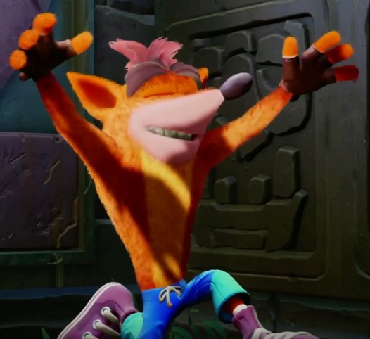
This is not Crash.
Why mess up with the character animations and art direction of the game!? damn you activation you had one job

this is satire, yeah?
This is not Crash.
Why mess up with the character animations and art direction of the game!? damn you activation you had one job
Well, I played SM64 and Crash for the first time each a couple years back and I think Crash aged waaaaay better. Holds up really well.
If there's one thing I hope they do, while leaving the entire series unchanged...
Just add more hilarious death animations.
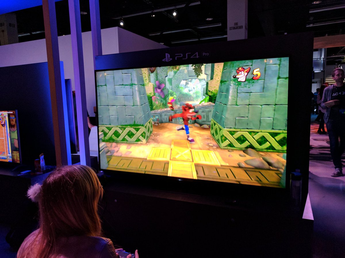
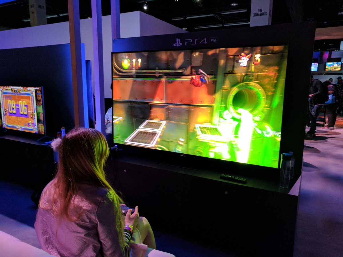
Seems like all this footage was form crash 1. Do you think they just aren't finished with the others, or are they going to pull some shit where only the first is a complete remake and the others are just up-ressed.?
You actually think that would ever happen? LMAO
This war over Crash's design is reaching Sonic fandom levels of bickering. XD
Thanks for the new avatar
OK.I look forward to release where everyone finally realises these are middling platformers that do not hold up well.
I look forward to release where everyone finally realises these are middling platformers that do not hold up well.
I look forward to release where everyone finally realises these are middling platformers that do not hold up well.
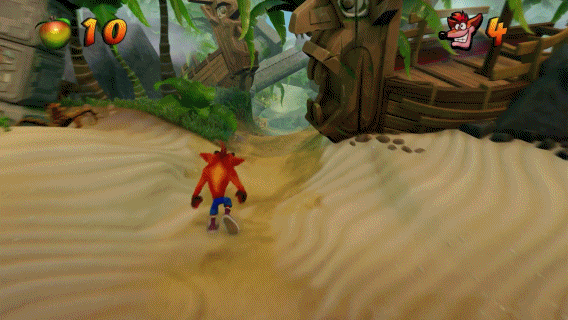
Honestly think the original looks much better.At the risk of being that guy on the internet who boosts up the colours and contrast on a video to make it look how he thinks it should look, here's me doing that:
Fingers crossed the final product looks a bit brighter/bolder. The footage shown looks kinda drab in places, especially in some of the outdoor areas.
You actually think that would ever happen? LMAO
I look forward to release where everyone finally realises these are middling platformers that do not hold up well.
OK.
*Psssst* this probably wont happen
I look forward to release where everyone finally realises these are middling platformers that do not hold up well.
Honestly think the original looks much better.
At the risk of being that guy on the internet who boosts up the colours and contrast on a video to make it look how he thinks it should look, here's me doing that:
Fingers crossed the final product looks a bit brighter/bolder. The footage shown looks kinda drab in places, especially in some of the outdoor areas.
Probably not since there's a picture of the box art.is this digital only?
is this digital only?
And that's perhaps why they're doing it. Maybe the subtler palette is what people prefer in 2016.
One of the things that I remember Crash for is how bright and colourful it was; I mean, look at my avatar. That orange is almost radioactive.
It's already too bright in areas. The problem is color saturation and just wrong coloration in places. Crash was a bit more firey orange, for starters. The stone pillars were more aged looking. They should look like ancient ruins, not like someone made them yesterday.
I kinda like both. Yours has that poppy, cartoon look to it, but the original brings out a crazy, realistic look. It's actually kind of odd and awesome at the same time. I do like what they've done more, but totally get where you're coming from. You can probably just adjust your TV settings anyway. This is going to be great...I believe.
Animations, graphics, and motion blur are absolutely on-point. This is looks like very high quality remaster.
Animations, graphics, and motion blur are absolutely on-point. This is looks like very high quality remaster.
Artstyle is horrible. Looks fan made.
Wait, where is this box art?Probably not since there's a picture of the box art.