Pretty much this.If they just booted up to 5 large icons, it would handle what I need to do 99% of the time - and let me assign a quick-key to each:
- Play game in drive
- Games installed on HDD
- Friends List/Social Page
- Netflix
- PS Store
I can dig for the System Configuration, etc the 1 time a year I'll need to use it.
-
Hey, guest user. Hope you're enjoying NeoGAF! Have you considered registering for an account? Come join us and add your take to the daily discourse.
You are using an out of date browser. It may not display this or other websites correctly.
You should upgrade or use an alternative browser.
You should upgrade or use an alternative browser.
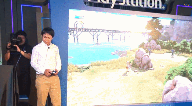
PS4 UI demo at Hong Kong event
- Thread starter Canis lupus
- Start date
wapplew
Member
As what I said, simple and fast doesn't mean it need to be ugly or terrible in the design. It doesn't need extra transition, it just need something to make the good use of the space so it won't look empty.
Good UI using the empty space to the potential, now look at this new PS4 UI? so many empty space while the icon were so small. I mean c'mon, this design kinda look like a Chinese branded cheap TV box that I could buy for $10.
Again FOR ME, I just wish Sony with the upcoming update could make the UI look better that this one.
It look empty because all those notification and friend list preview doesn't have anything on it yet.
When you get friends and massages, those space will fill up with it.
It actually more fast and convenience, all you have to do is push up and have a glance, and you get all the latest info without loading into apps.
awesomebro
Member
Translating from Japanese to Chinese. Crazy.
However, that is one ugly as fuck UI. It's pretty basic and uninspiring. I would have expected Sony to go with chromium or something similar or even android. This is just garbage. I would have also expected them to let their American arm design the UI but they let their Japanese arm do the job that's why it looks like it's stuck in 1999.
However, that is one ugly as fuck UI. It's pretty basic and uninspiring. I would have expected Sony to go with chromium or something similar or even android. This is just garbage. I would have also expected them to let their American arm design the UI but they let their Japanese arm do the job that's why it looks like it's stuck in 1999.
Captain Tuttle
Member
Well Sony knows how to make an uninteresting UI, I'll give them that.
Risk Breaker
Member
Looking good.
Anyone comparing the PS4's 15 minutes of recording at a decent quality with the Game DVR of 30 seconds with shit quality is insane btw.
Anyone comparing the PS4's 15 minutes of recording at a decent quality with the Game DVR of 30 seconds with shit quality is insane btw.
Impressive speed.
I didn't realize it has to be one or the otherRemember people, we are playing games, not the interface.
in fact i give up...
but im really disappointed from the taste of the ppl if they like that
You didn't even bother to make your point clear.
Visual part of it? Yeah, probably (need to see actual screens as early screenshots would have focused on functionality).
But video cutting part you brought up, showed the screen was better (functionaly) as it allowed to find the right frame with less clicks.
Clinton514
Member
Simple is good for me. Better than navigating through a bunch of useless crap.
Omnistalgic
Member
I don't really see them doing it if the way they handled the PS3's UI is any indication. I think we're going to be using something very close to what's in these videos for the next five to six years.
weren't the reason the XMB wasn't updated frequently due to design issues? I'm sure Sony wanted to implement X-game chat but the memory issues came into play. It was not based on Sony being slow with updating, but technical abilities on the software side of the platform.Based on 7 years with the ps3 xmb, that is not likely to happen.
I'm sure Cerny has designed both the Vita/PS4 with the ability to update it's UI over time, so the these comments aren't really fair IMO. It was less to do with Sony being dogmatic versus the limitations of the PS3.
MutonCommander
Banned
Um how so?
When I see both UIs in action, this my gut reaction: The Xbone's ui provides a lot of cool features and non-game functionality, the PS4's ui is a classic console UI. On first glance the Xbone seems like the 'nextgen' device while the PS4 is the more traditional console. I know most people here prefer Sony's approach but recent footage from both uis makes me wonder whether MS's approach is in fact the right one for the mainstream.
Please don't label me as a Microsoft fanboy guys, check my post history. I'm just being honest about my gut reaction.
CambriaRising
Member
I think it looks pretty good. I couldn't care less about being able to change a background.
iamshadowlark
Banned
If Metro is and example of an "American" OS, I think the Japanese are doing something right that we haven't caught on to.Translating from Japanese to Chinese. Crazy.
However, that is one ugly as fuck UI. It's pretty basic and uninspiring. I would have expected Sony to go with chromium or something similar or even android. This is just garbage. I would have also expected them to let their American arm design the UI but they let their Japanese arm do the job that's why it looks like it's stuck in 1999.
MikeE21286
Member
It has to be clean and fast. If so then it will have done its part.
R3TRODYCE
Member
Translating from Japanese to Chinese. Crazy.
However, that is one ugly as fuck UI. It's pretty basic and uninspiring. I would have expected Sony to go with chromium or something similar or even android. This is just garbage. I would have also expected them to let their American arm design the UI but they let their Japanese arm do the job that's why it looks like it's stuck in 1999.
Haha harsh.
entremet
Member
If Metro is and example of an "American" OS, I think the Japanese are doing something right that we haven't caught on to.
Japanese graphic design and UIs have been a mess for a while now. UI design is more than just Microsoft. Look at iOS, Android, and even stuff like Nest thermostats.
Look at this:
http://capcom.co.jp/
And many more examples. Anyone is the graphic and web design industry knows that Japanese graphic design is pretty lackluster.
Risk Breaker
Member
When I see both UIs in action, this my gut reaction: The Xbone's ui provides a lot of cool features and non-game functionality, the PS4's ui is a classic console UI. On first glance the Xbone seems like the 'nextgen' device while the PS4 is the more traditional console. I know most people here prefer Sony's approach but recent footage from both uis makes me wonder whether MS's approach is in fact the right one for the mainstream.
Please don't label me as a Microsoft fanboy guys, check my post history. I'm just being honest about my gut reaction.
What exactly does the Xbone OS offer that is so different to PS4? From my time with it I didn't see many differences apart from Snap, which you might or might not like.
I see a lot of visual bloat on Xbone's OS, like in the achievements section, compared to the simpler, more structured PS4's trophies section, for example. Same with settings or friends.
Can Crusher
Banned
I prefer the old XMB, but this looks pretty good.
Even without custom backgrounds, I'm about 99% sure that the colours will be adjustable; if I can get my all-black minimalist thing going at launch, I'll be happy.
The load times are a bit of a concern though. Hopefully, this is just caused by a poor server connection -- the browser stuff seemed dead slow as well.
I think the load times are due to PS4 not having flash embedded in it. Xbox One comes with 8GB for example. This is where a SSHD will come in handy.
TheCanisDirus
Member
naaa i know inside myself that ppl dont like that blue...
they just accepting it
Man, you got some projection issues going on. Opinions, you've heard of them i'm positive. What you may see as boring, and blue others might find concise/to-the-point, minimalist and refined.
Omnistalgic
Member
Don't have any issues with UI Design was. Seems fairly basic and has the feel of a nice "starting" point. But this no custom background thing has to change, and has to change quickly. along with MP3, it just seems like an incomplete OS. Playing around with Smartphones and Tablets today, I think users are definitely gonna notice the absence of these features. Won't matter much the first few months with hardcore though, so I'll likely pick up my PS4 when these more subtle features are getting looked at.
Avatar system (Home?)
Media Playback
UI customization features
Looking forward to see what Sony does in these areas. Too barebones for me atm and no must-have experience at launch.
Avatar system (Home?)
Media Playback
UI customization features
Looking forward to see what Sony does in these areas. Too barebones for me atm and no must-have experience at launch.
Is that clip while a game is running?Impressive speed.
BruiserBear
Banned
Translating from Japanese to Chinese. Crazy.
However, that is one ugly as fuck UI. It's pretty basic and uninspiring. I would have expected Sony to go with chromium or something similar or even android. This is just garbage. I would have also expected them to let their American arm design the UI but they let their Japanese arm do the job that's why it looks like it's stuck in 1999.
I sincerely considered creating a thread weeks ago saying I was concerned the one thing Sony was going to screw up on the PS4 was the UI. So much of this console was handled by western people from Sony, except the UI. It's still being handled by a secret team in Japan that we never hear a god damn thing about. It's a shame they didn't place more importance on this.
Is that clip while a game is running?
Yeap. Straight from Knack gameplay.
entremet
Member
I sincerely considered creating a thread weeks ago saying I was concerned the one thing Sony was going to screw up on the PS4 was the UI. So much of this console was handled by western people from Sony, except the UI. It's still being handled by a secret team in Japan that we never hear a god damn thing about. It's a shame they didn't place more importance on this.
Yep. So strange.
travisbickle
Member
Translating from Japanese to Chinese. Crazy.
However, that is one ugly as fuck UI. It's pretty basic and uninspiring. I would have expected Sony to go with chromium or something similar or even android. This is just garbage. I would have also expected them to let their American arm design the UI but they let their Japanese arm do the job that's why it looks like it's stuck in 1999.
Mid 2000s Vista I would give you, but do you actually remember UIs in the late 90s? (windows 98, for example)
Is that clip while a game is running?
Yes , he suspends and resumes Knack a couple of times.
wapplew
Member
When I see both UIs in action, this my gut reaction: The Xbone's ui provides a lot of cool features and non-game functionality, the PS4's ui is a classic console UI. On first glance the Xbone seems like the 'nextgen' device while the PS4 is the more traditional console. I know most people here prefer Sony's approach but recent footage from both uis makes me wonder whether MS's approach is in fact the right one for the mainstream.
Please don't label me as a Microsoft fanboy guys, check my post history. I'm just being honest about my gut reaction.
You are right, MS UI look more fancy and attracting because of all those transition animation and stuff. It get more attention for sure.
But when it come down to function and feature, they are both quite similar.
Sony UI might have an edge on convenience by the look of it.
You don't need to load in to game to get in game news for one.
Massage, friend list, trophy, notification, party just a push away, same as app feed,
you can get those information without loading into those app.
awesomebro
Member
If Metro is and example of an "American" OS, I think the Japanese are doing something right that we haven't caught on to.
Take your goggles off. I mean look at this ui. Even though I'm not too crazy about metro, it's still better than this. The xbox one's ui looks much more better than this. It's more attractive and I would say it's more functional. Also all that blue space. Makes me want to throw up. Ugh. They should have allowed dynamic themes to distract us from the ugliness.
mentallyinept
Banned
Is that clip while a game is running?
Yes.
D
Deleted member 20920
Unconfirmed Member
Where are the media options?
Media options as in apps like Netflix?
Asia countries like Singapore and Hong Kong have not really embraced such services much.
blackbish0p
Banned
That PS4 UI looks really bland.
Yeap. Straight from Knack gameplay.
Good. This is where I constantly diverge from the popularity of XMB here on GAF. XMB's efficiency ended when you pulled it up as a background process. Getting to messages, invites, or trophies was a trudge.Yes , he suspends and resumes Knack a couple of times.

It looks fine. As long as everything works quickly, I won't have a problem with it. I think it would be great if Playstation would introduce touch pad gestures to control the UI akin to a MacBook. That said, the Xbox One's interface looks more mature and a lot better.
Both aren't ideal, in my opinion. I would like to see a console UI adopt what we already see in tablets or smartphones. With the size of TVs these days, you could easily display 24 unique apps on screen at once with a customizable static dock.
Going back to my idea about touch gestures controlling the UI, you could have a main app/games drawer as the home screen (vertical scrolling), swipes to the right instantly take you to your open apps (say, 5 open apps or 4 apps and 1 game at a time?), and a swipe to the left of your home screen takes you to live widgets (facebook, twitter, etc.). You could even have functions for the home button, much like the iphone (single tap brings you to your app drawer, double tap brings up static dock in whatever app/game your in).
GrizzleBoy
Banned
I have to press a button to sign in?

lawl
Yep, the part where a guy picked up a second PS4 controller to join as second player, sat in front of the camera, then had to pick from a list of people to sign in as was quite revealing.
The way the camera worked during non lightbar based activity was also revealing. Overall it seems just nowhere near as integrated/functional.
ThisWreckage
Banned
Less is more. The Xbox One interface looks busy and cramped by comparison. As long as it is efficient I don't care.
wapplew
Member
It looks fine. As long as everything works quickly, I won't have a problem with it. I think it would be great if Playstation would introduce touch pad gestures to control the UI akin to a MacBook. That said, the Xbox One's interface looks more mature and a lot better.
Both aren't ideal, in my opinion. I would like to see a console UI adopt what we already see in tablets or smartphones. With the size of TVs these days, you could easily display 24 unique apps on screen at once with a customizable static dock.
Going back to my idea about touch gestures controlling the UI, you could have a main app/games drawer as the home screen (vertical scrolling), swipes to the right instantly take you to your open apps (say, 5 open apps or 4 apps and 1 game at a time?), and a swipe to the left of your home screen takes you to live widgets (facebook, twitter, etc.). You could even have functions for the home button, much like the iphone (single tap brings you to your app drawer, double tap brings up static dock in whatever app/game your in).
Those are really good idea, and the widget things too. I hope it doesn't take up too much ram and processing power.
iamshadowlark
Banned
Japanese graphic design and UIs have been a mess for a while now. UI design is more than just Microsoft. Look at iOS, Android, and even stuff like Nest thermostats.
Look at this:
http://capcom.co.jp/
And many more examples. Anyone is the graphic and web design industry knows that Japanese graphic design is pretty lackluster.
Thats why the key word is example. But still, there isn't really anything I see wrong with sony's UI that is outside of aesthetics. Which is fairly simple to fix. It'd be different if the UI was a cluttered mess but it isn't IMO. In fact I'd throw that comment more toward MS, who far as I know, have abstained from showing us controller navigation to any meaningful extent?
Why exactly?Take your goggles off. I mean look at this ui. Even though I'm not too crazy about metro, it's still better than this. The xbox one's ui looks much more better than this. It's more attractive and I would say it's more functional. Also all that blue space. Makes me want to throw up. Ugh. They should have allowed dynamic themes to distract us from the ugliness.
Forensic Scene
Member
As long as navigation is quick, I could care less.
I love that UI, simple and minimalistic, wont confuse me....
Also, I want my background to change colour based on the time!

Also, I want my background to change colour based on the time!
It look empty because all those notification and friend list preview doesn't have anything on it yet.
When you get friends and massages, those space will fill up with it.
It actually more fast and convenience, all you have to do is push up and have a glance, and you get all the latest info without loading into apps.
Do people really think this looks SO MUCH better?
In my theory, I believe its due to the cool thumbnails of World War Z, Ryse, Skype, etc. They stimulate our brains perhaps, like dopamine. Remove those and you have a bunch of green squares.
The facts are: If you want to get to your friends, you leave to a different page/tab/app. On the PS4 UI, you scroll, and it instantly shows your list, similar to the PS3. Same with Messages on X1, you must leave to a new tab. Again, they look to be instant after scrolling to 'messages' on the PS4 (from the looks of it).
The Sharing UI is nicer on the X1 because you dont have to go to a new page like the Ps4. However, the ps4 has longer capturing and has a sharing button on the controller so their convenience is tied, IMO.
The dynamic menus on the Ps4 UI is a good feature too if used wisely by devs. Hopefully they aren't slow to load like the video or else it loses points.
I do like the features of viewing # of players in top games and the 'following' feature on the X1.
(I know this is not the main area but its the same other than the live feed and ads on the right)

In my theory, I believe its due to the cool thumbnails of World War Z, Ryse, Skype, etc. They stimulate our brains perhaps, like dopamine. Remove those and you have a bunch of green squares.
The facts are: If you want to get to your friends, you leave to a different page/tab/app. On the PS4 UI, you scroll, and it instantly shows your list, similar to the PS3. Same with Messages on X1, you must leave to a new tab. Again, they look to be instant after scrolling to 'messages' on the PS4 (from the looks of it).
The Sharing UI is nicer on the X1 because you dont have to go to a new page like the Ps4. However, the ps4 has longer capturing and has a sharing button on the controller so their convenience is tied, IMO.
The dynamic menus on the Ps4 UI is a good feature too if used wisely by devs. Hopefully they aren't slow to load like the video or else it loses points.
I do like the features of viewing # of players in top games and the 'following' feature on the X1.