You do realize that all you've been posting are old, outdated mockups from the very early build of the firmware right?
Or maybe perhaps that's the only way your post even passes as acceptable?
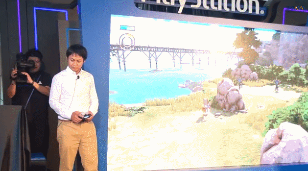
you can find it again at 15.11 of this new video
You do realize that all you've been posting are old, outdated mockups from the very early build of the firmware right?
Or maybe perhaps that's the only way your post even passes as acceptable?
The good news is software isn't set in stone like the hardware. Sony can constantly iterate the UI if people are unhappy with it.
Based on 7 years with the ps3 xmb, that is not likely to happen.The good news is software isn't set in stone like the hardware. Sony can constantly iterate the UI if people are unhappy with it.
You're talking about decoration, not design. It's a very common mistake to make since the word 'design' is misused all the time.
You're talking about decoration, not design. It's a very common mistake to make since the word 'design' is misused all the time.
let me show this...
honestly FOR YOU ..this are well designed menu/screens?


You try too hard. I've tried a more recent UI build myself at the PS4 Experience, and the share menu looks nothing like that now.you can find it again at 15.11 of this new video
im talki aboud design where inside the design you can find the category graphic designe etc etc
oh... ok, that got a chuckle out of me lolRay Charles indeed
Suddenly, this thread reminds me the immortal metaphor of Don Quixote against the windmills...
No he is right in that it is also design and aesthetic, in this instance graphic design. But attractive graphic design doesn't necessarily mean good functionality. Form over function so to speak. To me whilst graphically and aesthetically the Xbox One's UI may look more attractive (I actually dislike the Metro tiles look in both), it also seems far more cluttered and convoluted, and doesn't seem particularly easy to use at all.
The chances are the PS4's UI will be more simplistic and easy to use, perhaps quicker too, and ultimately that is as important if not more important than having a sexy look.
in fact i give up...
but im really disappointed from the taste of the ppl if they like that
Problem with your approach (there's generally a problem with your approach to most things so no surprise), is that you're only considering one aspect of UI design, that is aesthetics, and not function or ease of use. As the user above pointed out, it's very likely that the preview tiles may ensure the PS4's take on video editing in the UI is more functional than the Xbox One's, despite looking less pretty.
We won't know for sure till we get a better comparison.
in fact i give up...
but really disappointed from the taste of the ppl if they like that
You're disappointed that we like better designs!? Gosh, I'll never be able to sleep again.
naaa i know inside myself that ppl dont like that blue...
they just accepting it


oh Nib thnx....yeah maybe my approch is generally wrong or i dont know (if i been banned there must be a reason)....i dont know honestly who will be more easy to use...but i think ppl are HOPING that the ps4 os is faster/easier.....that coul dbe a chance ..but also couldnt...
one thing is sure....is not attractive....can we agree on this?
naaa i know inside myself that ppl dont like that blue...
they just accepting it
I think many would take it as a compliment for you to be disappointed in their taste.
What? Thank you, TheKayle, for making me realize I don't actually like that shade of blue! I've been living a lie.
/s
Please don't mistake design for decoration.
I absolutely loathe anything animated or involving transition animation in a UI, which is why I dislike everything about the Xbone UI - it's always so damn busy and saying 'Hey! Look at me! I'm like an attract sequence!.'
For me this continuation of the PS3s XMB design philosophy is a joy to behold.
Dude....just stop m. We're mostly grown here, you should be able to accept that not everybody shares your tastes. You're starting to look silly.naaa i know inside myself that ppl dont like that blue...
they just accepting it
You try too hard. I've tried a more recent UI build myself at the PS4 Experience, and the share menu looks nothing like that now.
oh Nib thnx....yeah maybe my approch is generally wrong or i dont know (if i been banned there must be a reason)....i dont know honestly who will be more easy to use...but i think ppl are HOPING that the ps4 os is faster/easier.....that coul dbe a chance ..but also couldnt...
one thing is sure....is not attractive....can we agree on this?
naaa i know inside myself that ppl dont like that blue...
they just accepting it
oh Nib thnx....yeah maybe my approch is generally wrong or i dont know (if i been banned there must be a reason)....i dont know honestly who will be more easy to use...but i think ppl are HOPING that the ps4 os is faster/easier.....that coul dbe a chance ..but also couldnt...
one thing is sure....is not attractive....can we agree on this?
TheKayle shows up, thread goes to shit, not that i'm surprised. Anyways, the UI isn't the greatest looking thing ever but seems functional and fast enough to get the job done. Customization options would be nice though.
The Xbone UI is much better in both form and function and it makes me wonder if Microsoft was right after all. The differences in resolution won't be immediately apparent to common folk, while the differences in UI functionality are obvious in plain sight.
Remember people, we are playing games, not the interface.
The more I see of this UI, the more uninspired it looks. Those big blue icons for Internet, etc. Also, the time it takes for that data to load in is a bit much.
How could you possibly know that it's better in function when you've never used it? Please answer this question, because logically, it makes less sense than anything said in this thread.
Remember people, we are playing games, not the interface.
Um how so?The Xbone UI is much better in both form and function and it makes me wonder if Microsoft was right after all. The differences in resolution won't be immediately apparent to common folk, while the differences in UI functionality are obvious in plain sight.
The Xbone UI is much better in both form and function and it makes me wonder if Microsoft was right after all. The differences in resolution won't be immediately apparent to common folk, while the differences in UI functionality are obvious in plain sight.
It can do more stuff, I thought we already knew this months ago. Why are you so surprised by it?
im talkin about design where inside the design you can find the category graphic design etc etc