Deadly Cyclone
Pride of Iowa State
Pretty basic and a bit ugly. I'll take it if it works fast though. I like the XBO UI more, however.
That's not a mockup! That's from the live demonstration at Gamescom.yeah that mockup have nothing to do with the real os
It's the UI for the PS4 ergo next gen.
I sincerely considered creating a thread weeks ago saying I was concerned the one thing Sony was going to screw up on the PS4 was the UI. So much of this console was handled by western people from Sony, except the UI. It's still being handled by a secret team in Japan that we never hear a god damn thing about. It's a shame they didn't place more importance on this.
As long as navigation is quick, I could care less.
Same here. I don't care if the UI looked like the worst UI ever. As long as it's fast and the console can do everything, I'm quite fine with it.I'll take the UI/OS that's not taking up almost half of the system's ram to be functional.
naaa i know inside myself that ppl dont like that blue...
they just accepting it
Other than personal preference over aesthetics, what has Sony "screwed up" about the UI in your mind?I sincerely considered creating a thread weeks ago saying I was concerned the one thing Sony was going to screw up on the PS4 was the UI. So much of this console was handled by western people from Sony, except the UI. It's still being handled by a secret team in Japan that we never hear a god damn thing about. It's a shame they didn't place more importance on this.
All you metro loving, tablet loving, flat colour people need to just... ..fuck... seriously just fucking .,... god! stop.

ART
Pure motherfucking art.
Look at that shit, so goddamn good.
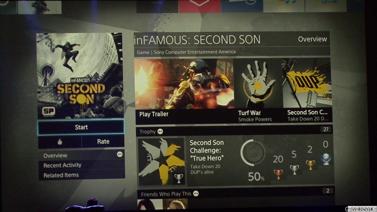
See my games? I can see in that screenshot it's FIVE clicks to the right.
For each click I do, it will get closer, confirming I'm on target.
See display settings? I can see in that screenshot it's FOUR clicks down
For each clcik I do it will animate closer, confirming I'm on target.
Both top bottom / left and right are HARD - they don't wrap around.
From muscle memory I know, EVEN WHEN MY TELEVISION IS OFF AND STILL WARMING UP.............. just scroll right right right right like 10 times (I'm definitely hard right) then press left left and I'm at my games. The TV doesn't even have to be goddamned on,.......... by the time it's warmed up, I can be at where I need to be.
The animation is minimal and simple - it's not intrusive
I can see more than 1 thing per page, jesus christ is that important
There's icons per page as well.
The XMB fucking decimates the Microsoft user interfaces, not because I'm a Sony fan, not because I'm buying a PS4, not "just because" - it decimates it due to better design, it's more logical, it's faster to work with yet still good to look at.
The XMB won awards and rightly so. It's almost all I could ask for in a basic UI - I'm sure it could be tweaked some but honestly, thank fucking fuck that Sony didn't lose their confidence and think "oh shit, maybe we too can replace the entire UI?!?" - they stuck with it and fucking huge kudos to them.
Long live the XMB.


Other than personal preference over aesthetics, what has Sony "screwed up" about the UI in your mind?
Banderas.gif with him looking at the XMB on his laptop.All you metro loving, tablet loving, flat colour people need to just... ..fuck... seriously just fucking .,... god! stop.
ART
Pure motherfucking art.
Look at that shit, so goddamn good.
See my games? I can see in that screenshot it's FIVE clicks to the right.
For each click I do, it will get closer, confirming I'm on target.
See display settings? I can see in that screenshot it's FOUR clicks down
For each clcik I do it will animate closer, confirming I'm on target.
Both top bottom / left and right are HARD - they don't wrap around.
From muscle memory I know, EVEN WHEN MY TELEVISION IS OFF AND STILL WARMING UP.............. just scroll right right right right like 10 times (I'm definitely hard right) then press left left and I'm at my games. The TV doesn't even have to be goddamned on,.......... by the time it's warmed up, I can be at where I need to be.
The animation is minimal and simple - it's not intrusive
I can see more than 1 thing per page, jesus christ is that important
There's icons per page as well.
The XMB fucking decimates the Microsoft user interfaces, not because I'm a Sony fan, not because I'm buying a PS4, not "just because" - it decimates it due to better design, it's more logical, it's faster to work with yet still good to look at.
The XMB won awards and rightly so. It's almost all I could ask for in a basic UI - I'm sure it could be tweaked some but honestly, thank fucking fuck that Sony didn't lose their confidence and think "oh shit, maybe we too can replace the entire UI?!?" - they stuck with it and fucking huge kudos to them.
Long live the XMB.
Yeah that looks like a mess. Works well as a touch screen but not with a controller.Do people really think this looks SO MUCH better?
(I know this is not the main area but its the same other than the live feed and ads on the right)
In my theory, I believe its due to the cool thumbnails of World War Z, Ryse, Skype, etc. They stimulate our brains perhaps, like dopamine. Remove those and you have a bunch of green squares.
The facts are: If you want to get to your friends, you leave to a different page/tab/app. On the PS4 UI, you scroll, and it instantly shows your list, similar to the PS3. Same with Messages on X1, you must leave to a new tab. Again, they look to be instant after scrolling to 'messages' on the PS4 (from the looks of it).
The Sharing UI is nicer on the X1 because you dont have to go to a new page like the Ps4. However, the ps4 has longer capturing and has a sharing button on the controller so their convenience is tied, IMO.
The dynamic menus on the Ps4 UI is a good feature too if used wisely by devs. Hopefully they aren't slow to load like the video or else it loses points.
I do like the features of viewing # of players in top games and the 'following' feature on the X1.
This! Really the only next Gen UI feature I was really wanting. Cause it directly related to games and that's what I'll be doing....Playing games not the interface.Wow, flipping between the game and the background app is instant.
Thats all i was interested in, the rest is just window-dressing.
In my theory, I believe its due to the cool thumbnails of World War Z, Ryse, Skype, etc. They stimulate our brains perhaps, like dopamine. Remove those and you have a bunch of green squares.
Do people really think this looks SO MUCH better?
As someone who uses Windows 8, I'm glad the PS4 UI doesn't look like Windows 8.
I'd rather it be simple and functional, which this looks like.
I won't be spending a lot of time admiring the UI anyways.
Well for starters we have the list of features that are missing. STILL can't change your PSN ID, can't customize the background, can't sleep suspend/resume a game, no DLNA support, no MP3 or music CD support, etc, etc.
Those are all features that fall on the shoulders of the UI team.
But beyond the basic functionality, I personally see the design as amateur on so many levels, and I'm not even a student of design, but even I can tell this is not *right*. I'm sure actual students of UI design would find a long list of flaws. It's simply not pleasing to my eyes.
Do you really believe the decision to not support mp3 was made by the ui team
Do you really believe the decision to not support mp3 was made by the ui team
Well for starters we have the list of features that are missing. STILL can't change your PSN ID, can't customize the background, can't sleep suspend/resume a game, no DLNA support, no MP3 or music CD support, etc, etc.
Those are all features that fall on the shoulders of the UI team.
But beyond the basic functionality, I personally see the design as amateur on so many levels, and I'm not even a student of design, but even I can tell this is not *right*. I'm sure actual students of UI design would find a long list of flaws. It's simply not pleasing to my eyes.
Xbone reminds me if people that go overboard with rainmeter(?) on their xp machines. I don't need to have all those options and buttons in my face all the time. I need something simple and sleek.
Well for starters we have the list of features that are missing. STILL can't change your PSN ID, can't customize the background, can't sleep suspend/resume a game, no DLNA support, no MP3 or music CD support, etc, etc.
Those are all features that fall on the shoulders of the UI team.
I've seen this complaint a lot and I don't get it. Who is spending so much time looking at the UI of any device that they absolutely need to put their personal spin on it? I'm saying this not to challenge but really out of ignorance because to me, this is a non-issue.
Nobody needs to, but after the war ps3 custom dynamic themes and the ability to have different wallpapers for each page in vita, it is very disappointing not to be able to customize my background as I wish. Especially since I can on the other Sony platforms.
Xbox One
My Pins
Better Voice Commands
TV Guide (for specific countries)
Snap
PS4
LiveArea(friends activity feed)
Longer Record Time for Sharing
Can someone update this, these are the advantages I can find for each so far.
Man, you got some projection issues going on. Opinions, you've heard of them i'm positive. What you may see as boring, and blue others might find concise/to-the-point, minimalist and refined.
Most of those things, as already pointed out by others, really have nothing to do with UI. So your personal insights on how "amateur" the UI really is, suddenly become very hollow. Why can't you guys ever just say "this thing doesn't appeal to my tastes" instead of trying to turn your personal preference into market-defining dogma?Well for starters we have the list of features that are missing. STILL can't change your PSN ID, can't customize the background, can't sleep suspend/resume a game, no DLNA support, no MP3 or music CD support, etc, etc.
Those are all features that fall on the shoulders of the UI team.
But beyond the basic functionality, I personally see the design as amateur on so many levels, and I'm not even a student of design, but even I can tell this is not *right*. I'm sure actual students of UI design would find a long list of flaws. It's simply not pleasing to my eyes.
show this to a famous graphic designer and will insult who did it..for the rest of his life
")