Chobel
Member
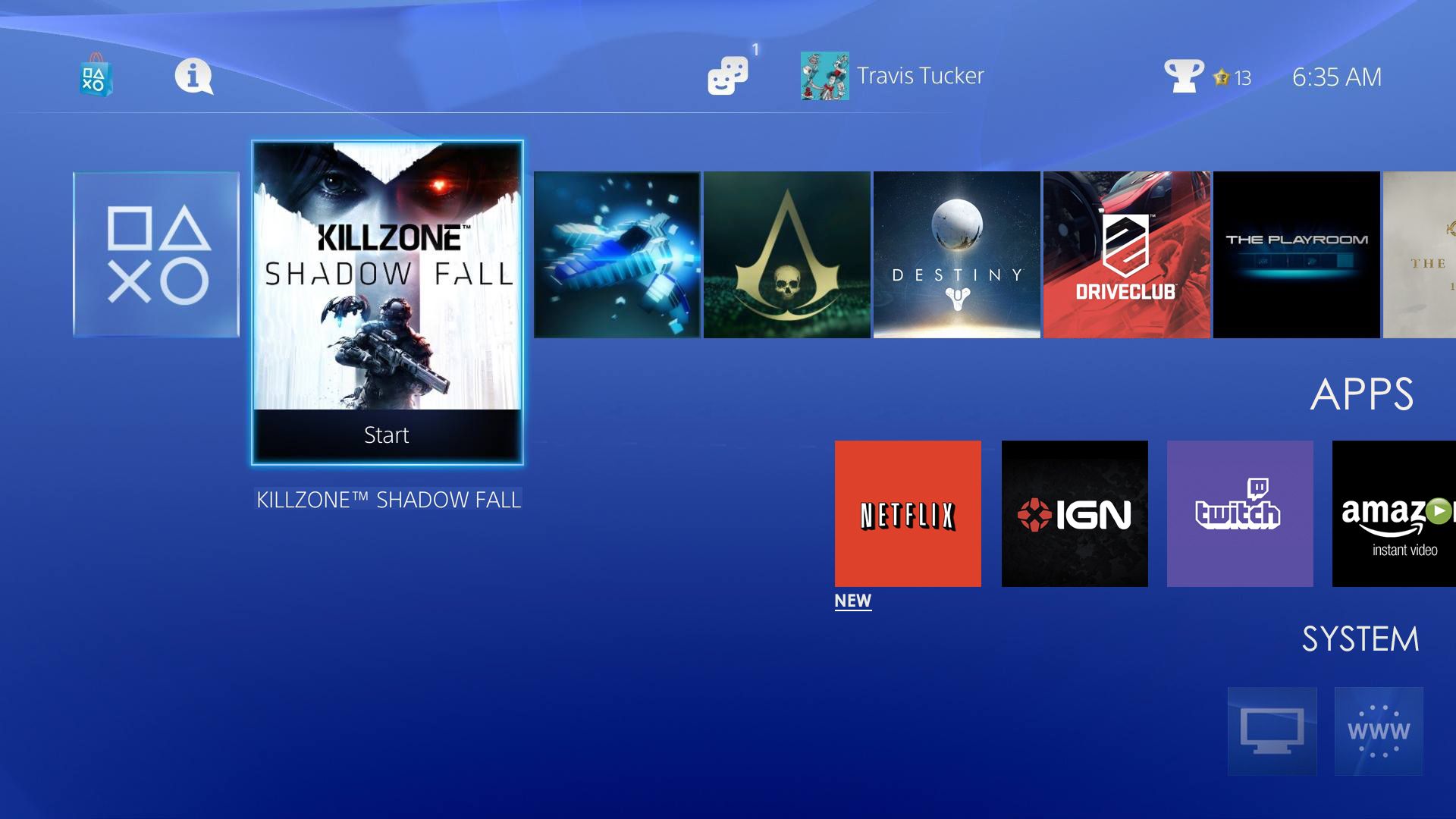
Yeah I would love that feature. I was playing around this afternoon with custom backgrounds on the current UI. I reconstructed the UI in photoshop and started changing the backgrounds. It's amazing how much it transforms it. And seeing as we seem to be posting mockups. Here are a few examples.
https://farm4.staticflickr.com/3860/14876785472_a76e512dd8_b.jpg
https://farm4.staticflickr.com/3850/14874671654_8283517710_b.jpg <--- THIS
https://farm4.staticflickr.com/3910/14877109695_f64debbab0_b.jpg
https://farm6.staticflickr.com/5592/14690505828_145bd3fcfe_b.jpg <--- AND THIS
Need to know the pics used in 2 and 4...Please! They look so good.