The Pikachu render has been bugging me. I can't seem to find it either.Woah...is that a new Pikachu render? I can't place that from any existing games.
-
Hey, guest user. Hope you're enjoying NeoGAF! Have you considered registering for an account? Come join us and add your take to the daily discourse.
You are using an out of date browser. It may not display this or other websites correctly.
You should upgrade or use an alternative browser.
You should upgrade or use an alternative browser.
"Wii U" section of Wal-Mart Changed to "Nintendo"?
- Thread starter EndlessFloydian
- Start date
spyroflame0487
Member
The Pikachu render has been bugging me. I can't seem to find it either.
Maybe we can Beetlejuice Serebii in here. That's actually pretty fascinating if it's an all new render. We haven't got one since Smash, and Pokemon has kind of been the black sheep recently, especially with amiibo.
I'd go tinfoil had mode and say its for a new game, but it could just be that they wanted a new one for promo stuff. And it's definitely not the Pokken one which would ideally be the best one to use. (although that Pikachu has the Kirby angry face so)
I remember they used a Fox render for the amiibo promo material we couldn't pinpoint either. I haven't seen it in a while, but I don't think that ended up being anything from Star Fox Zero.Maybe we can Beetlejuice Serebii in here. That's actually pretty fascinating if it's an all new render. We haven't got one since Smash, and Pokemon has kind of been the black sheep recently, especially with amiibo.
I'd go tinfoil had mode and say its for a new game, but it could just be that they wanted a new one for promo stuff. And it's definitely not the Pokken one which would ideally be the best one to use. (although that Pikachu has the Kirby angry face so)
The Pikachu render has been bugging me. I can't seem to find it either.
Still better than the one they used for the 3DS XL

pinkurocket
Member
Alright, that's pretty red. Interesting.
Here in the UK the Nintendo sections have been relegated to a shelf in the corner.
It's alright Zhuge, everyone makes mistakes sometimes... even if its the entire UK retail arm.
mightynine
Member
Looking at that Gamestop picture really strikes me how those stores haven't changed at all - it's like looking at an Electronics Boutique. Even Babbage's had a nicer feel.
A complete overhaul for their store design/layout probably wouldn't hurt.
A complete overhaul for their store design/layout probably wouldn't hurt.
This is a new marketing initiative for Nintendo. Its hitting all across retail.
New coloring is red instead of blue and labeled simply Nintendo instead of Wii U / 3DS
Make of that what you will
Yup. Even my friends at my local GameStop told me their just waiting on the new banners from Nintendo and they too are making the switch.
Nintendo are clearly the ones spearheading this marketing change. Going back to the Red logo probably means a more "red theme" for their next hardware. Beyond that, this could mark a naming convention shift as well. NX itself could have arguably marked that in code speak (Nintendo X), but reality is I think they are going back to the Nintendo branding. No more Wii, or other names like that - we'll go back to owning Nintendo's.
Honestly, it's a pretty smart move. Nintendo as a company is still really well known. Making that company a true "brand" again is going to do well for them. It works in so many other markets too (do you own the new Nikes?). Etc.
Good on them.
PreyingShark
Member
"New Nintendo Console" and "New Nintendo Handheld" probably would have been better names than the Wii U and 3DS, actually.Where can I buy this "Nintendo"?!
Neff
Member
Going back to the red logo (assuming they are) is quite a big deal. They had big reasons for changing it to grey in the first place, that being doubling down hard on the broad, lifestyle-y image they'd started to cultivate during the DS Lite/Wii era. Going back to the impactful and iconic red after spending 7 years flirting with the style-conscious, Apple-esque grey is a potentially significant indicator as to where they're going as a company.
Also it can't be stressed enough how effective it is having a company mascot the same colour as your logo.
Also it can't be stressed enough how effective it is having a company mascot the same colour as your logo.
Pro from Dover
Member
Pikachu on red makes me hungry.
Beelzebufo
Banned
Right?! This is so exciting, if only because it harkens back to the GameCube era of Nintendo, which is my favorite.Going back to the red logo (assuming they are) is quite a big deal. They had big reasons for changing it to grey in the first place, that being doubling down hard on the broad, lifestyle-y image they'd started to cultivate during the DS Lite/Wii era. Going back to the impactful and iconic red after spending 7 years flirting with the style-conscious, Apple-esque grey is a potentially significant indicator as to where they're going as a company.
Also it can't be stressed enough how effective it is having a company mascot the same colour as your logo.
Here I walked into a GameStop and took a picture for you guys since no one wanted to. This is what Nintendos new branding looks like

Pikachu looks a little chubbier than usual in this render.
Pikachu looks a little chubbier than usual in this render.
Finally, the awaited return of chubby piks is at our hand.
I don't want to read too much into this because it likely doesn't mean anything, but I would love if they went back to red. Not necessarily the logo - the logo is fine, but it looks amazing with a red background like that.Going back to the red logo (assuming they are) is quite a big deal. They had big reasons for changing it to grey in the first place, that being doubling down hard on the broad, lifestyle-y image they'd started to cultivate during the DS Lite/Wii era. Going back to the impactful and iconic red after spending 7 years flirting with the style-conscious, Apple-esque grey is a potentially significant indicator as to where they're going as a company.
Also it can't be stressed enough how effective it is having a company mascot the same colour as your logo.
Pikachu looks a little chubbier than usual in this render.
20th anniversary of the Pokemon franchise in 2016; didn't they say they were promoting chubby Pika as an homage?
"New Nintendo Console" and "New Nintendo Handheld" probably would have been better names than the Wii U and 3DS, actually.
LOL what would you call it when they're old and the new systems come out though!?
James Scott
Banned
Found a new one

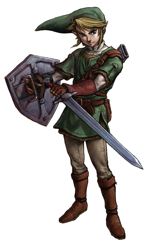
That's a new Link render, right?
That's a new Link render, right?
NX = Nintendo Experience
Which is what they are really.
Which is what they are really.
Found a new one
https://pbs.twimg.com/media/CPr9wXPWcAAUYn1.jpg:large[/]
That's a new Link render, right?[/QUOTE]
You mean drawing?
James Scott
Banned
The site I got it from says its for Mario's anniversary which wouldn't make too much sense since both Link and Pikachu are included
Better resolution pic

Better resolution pic
Found a new one
That's a new Link render, right?
Wow, that's definitely a new render. Twilight Princes Link promo art in HD. Exciting stuff!
I'm guessing the next console will have Nintendo in the name.
In the name name I mean.
i. e. something like Nintendo U.
How can you specifically tell it's TP link?
As opposed to like Ocarina of Time? If we could see if he had chainmail or not, we'd know.
Unless you just meant TP Link as in "Not Skyward Sword or Toon"
In the name name I mean.
i. e. something like Nintendo U.
Wow, that's definitely a new render. Twilight Princes Link promo art in HD. Exciting stuff!
How can you specifically tell it's TP link?
As opposed to like Ocarina of Time? If we could see if he had chainmail or not, we'd know.
Unless you just meant TP Link as in "Not Skyward Sword or Toon"
woah holy crapFound a new one
That's a new Link render, right?
It's alright Zhuge, everyone makes mistakes sometimes... even if its the entire UK retail arm.
I'm not kidding haha. It pretty much is every store in the UK.
I'm guessing the next console will have Nintendo in the name.
In the name name I mean.
i. e. something like Nintendo U.
All their consoles have Nintendo at the front haha.
mightynine
Member
This reminds me of how I recently stumbled across a Wal-Mart in the middle of nowhere Louisiana that still had Game Boy Advance signage up.
R
Rösti
Unconfirmed Member
I tried giving NoA a call about this alleged red logo, but I just got directed to customer service which of course couldn't help.
I greatly doubt they will be changing back to red for the logo however. Gray is much easier to work with, internally and externally.
I greatly doubt they will be changing back to red for the logo however. Gray is much easier to work with, internally and externally.
Obliterator
Member
Found a new one
That's a new Link render, right?
Yep new Red Nintendo looks so nice. Glad they are changing the marketing
Familienoberhauptvogel
Banned
Pikachu looks a little chubbier than usual in this render.
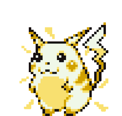
The new Pikachu is a bad influence on Pichus fat Pikachus are Pokemon desirable to be caught too.
What intrigues me is the red theme, not the logo itself. It looks really good this way.Rösti;179841043 said:I tried giving NoA a call about this alleged red logo, but I just got directed to customer service which of course couldn't help.
I greatly doubt they will be changing back to red for the logo however. Gray is much easier to work with, internally and externally.
wild wild rice
Member
Found a new one
That's a new Link render, right?
Exciting times!
Edit: Is that actually TP art or just a generic Link?
James Scott
Banned
Ah, maybe it is for TP HD. Would be a bit random for it to drop out of nowhere, but might make more sense than Zelda U art.Wow, that's definitely a new render. Twilight Princes Link promo art in HD. Exciting stuff!
WWHD promotional art was randomly shown in some experience show
All their consoles have Nintendo at the front haha.
Yeah, I know...
That's why I gave the example if it wasn't clear.
Ah, maybe it is for TP HD. Would be a bit random for it to drop out of nowhere, but might make more sense than Zelda U art.
WWHD promotional art was randomly shown in some experience show
Well, TP Link has been the go-to in general advertising for some time now depsite SS existing. So I wouldn't say it's indicative of anything.
I'm guessing the next console will have Nintendo in the name.
In the name name I mean.
i. e. something like Nintendo U.
How can you specifically tell it's TP link?
As opposed to like Ocarina of Time? If we could see if he had chainmail or not, we'd know.
Unless you just meant TP Link as in "Not Skyward Sword or Toon"
I found the gesture of Link on the sign to be really similar to this promo art of Link in TP:
I swear I've seen that Walmart sign in a store over a year ago. Thought it was just an old sign they never took down, because it's exactly what I expected from my local Walmart electronics. Guess it could be both!
The GameStop banners however look new.
Considering Nintendo attempted to become Apple-esque in their marketing (which harked back to the NES attempting to be a VHS) moving back to a character focus is way more likely especially with amiibo.
Which I just realized...amiibo is an interesting marketing strategy. Creating interactive toys for children, who will learn who the characters are by doing so, could potentially increase their appeal and garner both game and console sales. Changing to a more colorful approach will appeal again to children and families as well as lifelong Nintendo fans.
So I'm partially expecting a Splatoon anime in my head now, because it'd be a perfect way to use a new IP.
I found the gesture of Link on the sign to be really similar to this promo art of Link in TP:
oh ok. I was talking more about his clothes than the pose.
But...if he's not holding the sword, what's he holding?
Fire Rod confirmed Zelda UNX
R
Rösti
Unconfirmed Member
They haven't changed the typography however. It's still Avenir/Avenir Next in several weights.
Added: The text which says "New Games", "New Release" and "Accessories", not the typography of the logo.
Added: The text which says "New Games", "New Release" and "Accessories", not the typography of the logo.
Kissenkopf
Banned
Wow, that's definitely a new render. Twilight Princes Link promo art in HD. Exciting stuff!
Thats neither TP or SS Link it looks like a mixture of both of them. Damn, he looks good there...
Rösti;179841547 said:They haven't changed the typography however. It's still Avenir/Avenir Next in several weights.
I don't want Nintendo to change their logo's typeset. It'd be AWFUL.
R
Rösti
Unconfirmed Member
I didn't mean the typography of the logo, I meant the text which says "New Games", "New Release" and "Accessories". Should have clarified that.I don't want Nintendo to change their logo's typeset. It'd be AWFUL.
Ah, maybe it is for TP HD. Would be a bit random for it to drop out of nowhere, but might make more sense than Zelda U art.
WWHD promotional art was randomly shown in some experience show
Twilight Princess Remake incoming!???
oh ok. I was talking more about his clothes than the pose.
But...if he's not holding the sword, what's he holding?
Fire Rod confirmed Zelda UNX
Yes omg. So intrigued with this now haha. Wish we could see the full render of Link on that sign...
Thats neither TP or SS Link it looks like a mixture of both of them. Damn, he looks good there...
He looks really good indeed. Maybe is a render for Zelda U and they made some new renders for generic advertising as well?
Beelzebufo
Banned
And it doesn't say Mario or anything lol. It's actually the opposite of Mario's cap (white text on red), when it was closer to Mario before lolThe site I got it from says its for Mario's anniversary which wouldn't make too much sense since both Link and Pikachu are included
Better resolution pic
Make it happen Nintendo, leave the baggage behind, rising like a phoenix from the ashes

It's over. The console wars have been decided. The Big N is back
Mihael Mello Keehl
Banned
Thats not twilight princess link though! We must dig deeper!Found a new one
That's a new Link render, right?
It's over. The console wars have been decided. The Big N is back
Better get n or get out