The site I got it from says its for Mario's anniversary which wouldn't make too much sense since both Link and Pikachu are included
Better resolution pic

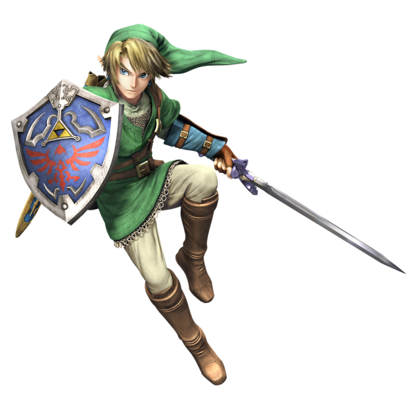
That's a brand new render. WHY!?
The site I got it from says its for Mario's anniversary which wouldn't make too much sense since both Link and Pikachu are included
Better resolution pic
Thats not twilight princess link though! We must dig deeper!
Well it looks like him. If it's an HD remake from Grezzo them they could make him more colorfulThats not twilight princess link though! We must dig deeper!
All their consoles have Nintendo at the front haha.
Well, WWHD had a new render.Of course Link looks like Link. But that is a brand new renders. And renders are for certain games even the amiibo line uses the same old renders for the silouhettes and stuff.
Going back to the red logo (assuming they are) is quite a big deal. They had big reasons for changing it to grey in the first place, that being doubling down hard on the broad, lifestyle-y image they'd started to cultivate during the DS Lite/Wii era. Going back to the impactful and iconic red after spending 7 years flirting with the style-conscious, Apple-esque grey is a potentially significant indicator as to where they're going as a company.
Also it can't be stressed enough how effective it is having a company mascot the same colour as your logo.
Pretty sure Halo was being made for Macs before MS stepped in. Not sure if they based their console around it, thoIs this why Master Chief is green?
The sword is weird. The scabbard is curved on the top which is newAm I insane for looking for differences between Master Sword sheath from the render and from Skyward Sword and Hyrule Warriors? There's something... odd in it. Looks more curved than usual.
What fox?Well, WWHD had a new render.
Also, it could mean nothing seeing as Fox got a new render that's not the Smash nor the Zero one
What fox?
This one
The site I got it from says its for Mario's anniversary which wouldn't make too much sense since both Link and Pikachu are included
Better resolution pic
Pretty sure Halo was being made for Macs before MS stepped in. Not sure if they based their console around it, tho
The sword is weird. The scabbard is curved on the top which is new
Scabbard=sheath. (I think)I think that's exactly how it was in Skyward Sword:
The sheath is bothering me, but sadly I cannot find high-quality pics of it in SS. Might want to boot the game to look.
Scabbard=sheath. (I think)
Oh. We are both concerned about the same thing then. I thought scabbard = guard, and English being my second language definitely didn't help me.

It's definitely different
That fox doesnt look new though, look like its from smash or somethingThis one
Isn't that Skyward Sword link?

A pic will be much appreciated.
It's definitely not Zelda Wii U Link though.
And Nintendo never really bothers making new arts if it's not part of the promo art of a new gamw.
Usually mario is from another game or promotional material but mario can literally be for anything since he is Nintendo's mascot. There is so many marios from club nintendo to hardware manuals.Don't they? I'm pretty sure most of the Mario renders they use aren't game specific. Or are those from Mario Party games or something?
From what I remember they've never done it with Zelda though
It could easily be for Zelda U. The Skyward Sword artwork looked pretty different from the in-game models.It's definitely not for Zelda U, it really just looks like Skyward Sword Link for the most part. I thought it was from the cgi trailer but the hair is too detailed, like Twlight Princess's. Definitely new.
White logo on red background. It stands out more.I'm straying a bit here...but as a designer this is kind of interesting. So, you guys prefer the white text on red, or the opposite; red on white?
I think the white on red works well for advertisement purposes (signage, even potentially billboards and stuff), but for actual merchandise (Amiibo, games, toys, etc) the white on red would likely get more use.
Of course the logo with the red on white could also change colors for a variety of products (The World of Nintendo figures for instance have different color boxes)
I'm straying a bit here...but as a designer this is kind of interesting. So, you guys prefer the white text on red, or the opposite; red on white?
I think the white on red works well for advertisement purposes (signage, even potentially billboards and stuff), but for actual merchandise (Amiibo, games, toys, etc) the white on red would likely get more use.
Of course the logo with the red on white could also change colors for a variety of products (The World of Nintendo figures for instance have different color boxes)
Found a new one

That's a new Link render, right?
It could easily be for Zelda U. The Skyward Sword artwork looked pretty different from the in-game models.
I'm straying a bit here...but as a designer this is kind of interesting. So, you guys prefer the white text on red, or the opposite; red on white?
I think the white on red works well for advertisement purposes (signage, even potentially billboards and stuff), but for actual merchandise (Amiibo, games, toys, etc) the white on red would likely get more use.
Of course the logo with the red on white could also change colors for a variety of products (The World of Nintendo figures for instance have different color boxes)
I honestly think it's just generic promo art like the old Fox render turned out to be, but I wouldn't rule out anything. It's definitely new though.I guess? Maybe if they changed the design drastically? I don't see why you'd assume so though. The Zelda U Link they've shown off didn't look that similar the Skyward Sword's. This one does.