CassidyIzABeast
Member
I have to press a button to sign in?


Please don't mistake design for decoration.
I absolutely loathe anything animated or involving transition animation in a UI, which is why I dislike everything about the Xbone UI - it's always so damn busy and saying 'Hey! Look at me! I'm like an attract sequence!.'
For me this continuation of the PS3s XMB design philosophy is a joy to behold.
I have to press a button to sign in?

GREEN. Balance
lol
I have to press a button to sign in?
I have to press a button to sign in?

let me show this...
honestly FOR YOU ..this are well designed menu/screens?


Good job posting the old UI mockups.let me show this...
honestly FOR YOU ..this are well designed menu/screens?


Assumption based on Sony not showing a damn thing. However I am not bothered as I hate using voice commands.
let me show this...
honestly FOR YOU ..this are well designed menu/screens?


So enlighten us: what is a well designed menu?
Because if it is supose to present all the information in a simple way, this it it


let me show this...
honestly FOR YOU ..this are well designed menu/screens?


The video showed instant switching from game to web browser didn't it?
People like transition animations, squares, and ads.Did people want a metro style UI or some shit? PS3's UI is very simple and intuitive, and this looks to follow on the same path. I like it.
What are you even talking about, first of all? There are multiple aspects of design, are you talking about usability or art choices?what look better designed for u ..tell me this


i really think u dont need a design degree to see it
what look better designed for u ..tell me this


i really think u dont need a design degree to see it
What are you even talking about, first of all? There are multiple aspects of design, are you talking about usability or art choices?

what look better designed for u ..tell me this


i really think u dont need a design degree to see it
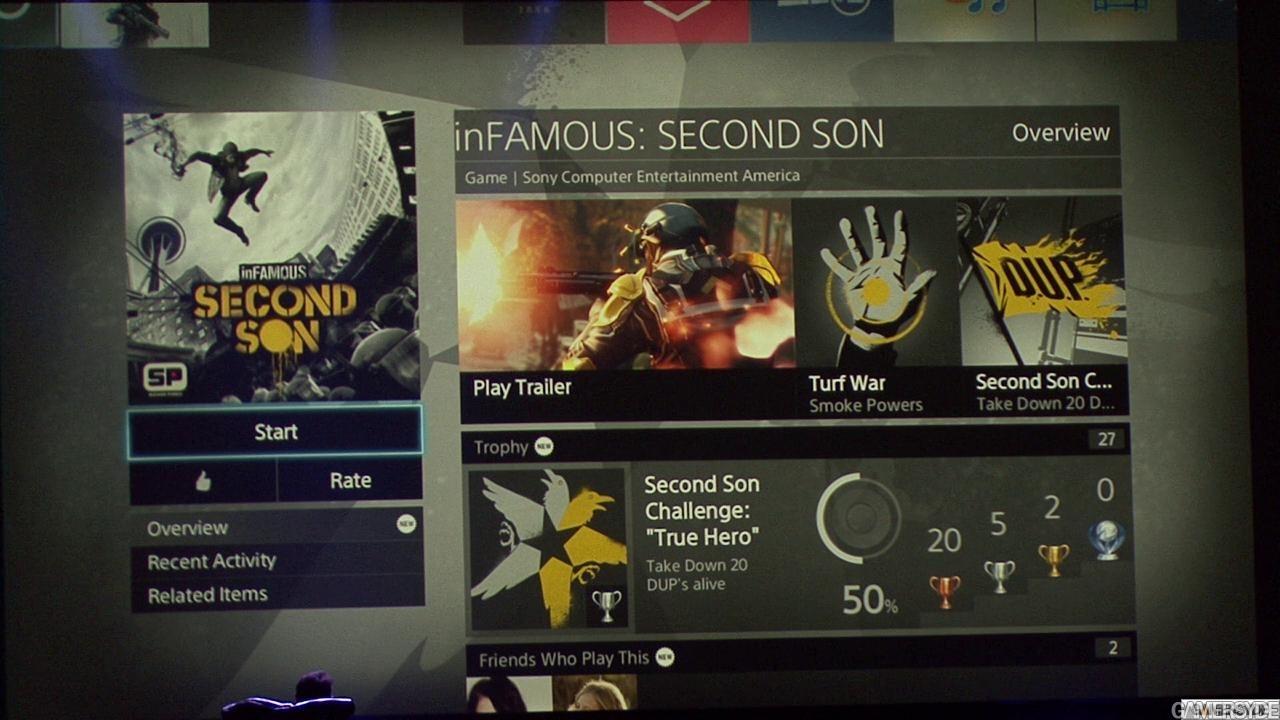
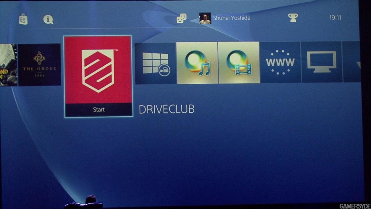
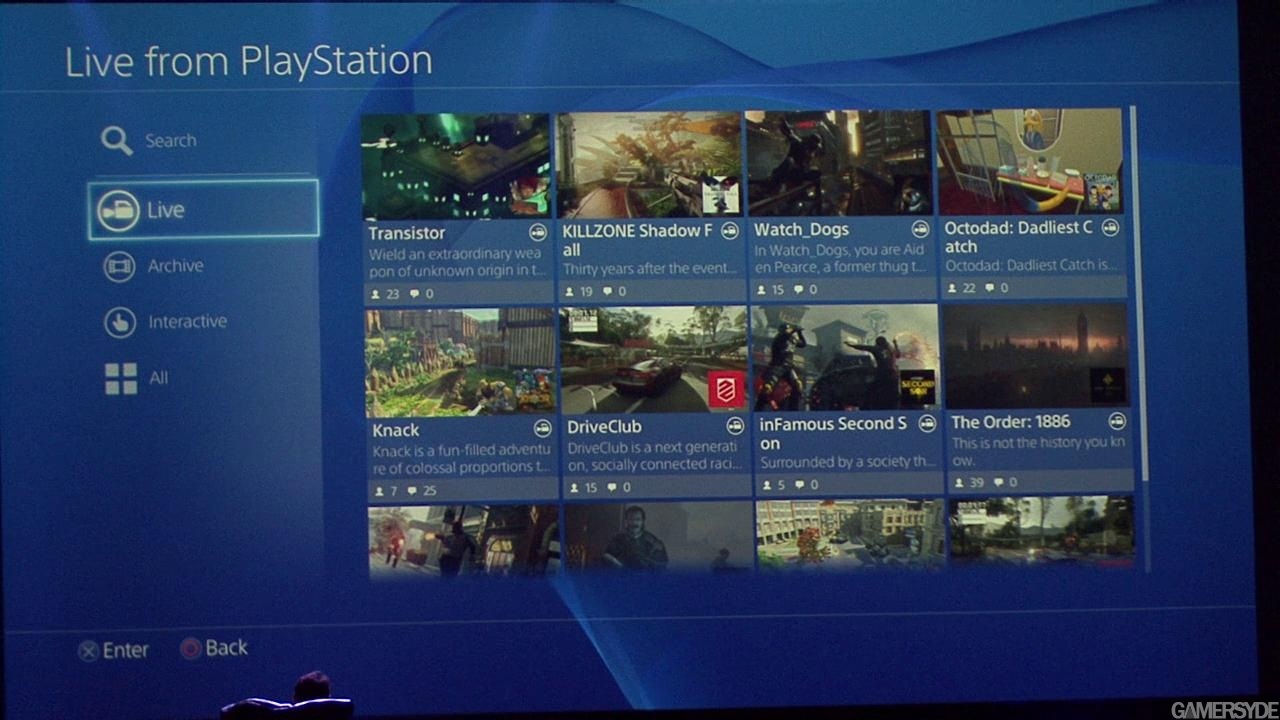
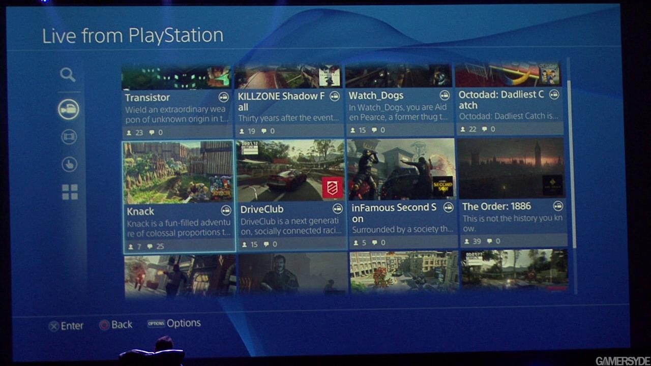


People like transition animations, squares, and ads.
sorry the screenshot that i should post is this.....the screen where u trim

both do the same things...both aspect.one is unactrative/ugly one is good designed
That's an old mock up, don't know if it's changed. Some shots from the GC vid.


Looks really slow it might be an old build hope is not like this on the 27th of nov...
So ...I'm gonna ask again. Which aspect are you talking about? Usability or aesthetics, because there is a different answer for both??sorry the screenshot that i should post is this.....the screen where u trim

both do the same things...both aspect.one is unactrative/ugly one is good designed
sorry the screenshot that i should post is this.....the screen where u trim

both do the same things...both aspect.one is unactrative/ugly one is good designed
thats scary..and hypocrite....an UI like everything else need to be usefull,attractive,beauty and this mean ALSO decorated....
your argoument could be used for everythign and if ppl was thinkin like this (but in the reality no one do) we was playing still textual games
The number of people that like Windows 8 confirms that...
Yet you still haven't said one aspect that makes a good design. Just saying "well, this one is better" doesn't mean that either are good

You do realize that all you've been posting are old, outdated mockups from the very early build of the firmware right?in a screen where a user need 4 buttons and a video?
u know what do the difference in the design? ..the colours the buttons design the icons..the fonts....
if u talk with a designer everything in the ps4 ui look ..."meh"..from the font to the choice of colors...to the manu shapes..to the icons ...

wtf guys are you defending this talented design masterpiece?!?!
in a screen where a user need 4 buttons and a video?
u know what do the difference in the design? ..the colours the buttons design the icons..the fonts....
if u talk with a designer everything in the ps4 ui look ..."meh"..from the font to the choice of colors...to the manu shapes..to the icons ...

wtf guys are you defending this talented design masterpiece?!?!
