• Hey, guest user. Hope you're enjoying NeoGAF! Have you considered registering for an account? Come join us and add your take to the daily discourse.

Code Name S.T.E.A.M. (IntSys 3DS) Assets (Box, Screens)

I'm not a huge fan of the visuals yet myself, though I'm waiting for the gameplay tomorrow to see how it looks in motion. A lot of people were hating on Wind Waker's initial reveal as well before they saw what the gameplay looked like.
 

Pikma

Banned
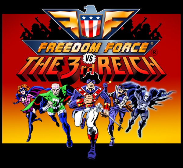
Actually, with the way they explained, I expected more like this

fftitle-1.jpg


And the cover shot pretty much made me think that


wut

Zinga has this "app art style" shit prevalent from mobile games. This ain't that.

Yeah, it totally reminded me of Freedom Force, even mentioned it on the liveblog thread, when I got to see it, I knew I was right.
 

Riposte

Member
I don't quite like the character designs so far, but I think I like the art style already.

EDIT: How can a game with 3D models look like a flash cartoon?
 

SuperPac

Member
Really does not look very appealing at all. Hopefully it makes a better case for itself in motion. I do not understand why they decided to announce this like they did.
 
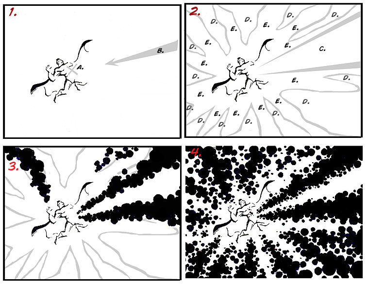
If they were going for that it would be uniform. Rather it seems like a combination of the two: evoking the coloring process for comics at the time, arranged in patterns like the actual "Kirby dots," seen below. You can note this on the "shafts" of dots in select places on the cover.

kirbydots.jpg

Yes, I know what Kirby Krackle is, and it's not what is depicted on that box art. They are using the dots of four-color printing as a stylistic flourish.
 
The art is a little disappointing. The graphics look a bit weak in the vein of Ghost Recon: Shadow Wars or Heroes of Ruin.

I don't care though, because it will look fine in motion, and the gameplay will be glorious.
 

SoulUnison

Banned
Not every game needs an anime art style.

I agree that box art is terrible and will negatively impact sales though.

The art inspiration for this game was specifically cited as *American comic books.*

Please don't be one of those people who think anything animated is "anime."
 
Upon closer inspect, I agree that the technique used to draw the art is very impressive. It's the character design that's off-putting.


I was personally expecting a modern take of a silver age Archie comic given the levity of the plot.
 
How is it offensive..?

the reason why it looks like a tie in with a Saturday morning cartoon type thing is because.. that's the point. I get not liking it but they didn't fail at what they're going for.

the whole description and tone of the game gives sense to these types of square jaw cartoon/comic guys

they're clearly going for that


I do feel like it has been done before tho, specially on mobile and whatnot, which can cheapen it.

it makes me think of freedom force and that's good

Just got home and watch the screens and boxart, and I can say that while i do not oime the screens that much I think the boxart is great. So yeah, im with what salsashark is saying, it really looks like the bike they are trying to go for.
Elite beat agents mix with a parody of american comic patriot heroes, thats exactly what it looks to me and I find it a really fun style.
And yeah, it reminded me a lot to freedom force.
 

lt519

Member
I think 3DS games look awesome.
There's so much stuff on this screen though and it's hard to tell what is what.

Part of that is bad art direction, part of that is visual systems I have no frame of reference for in the screenshots...

I don't know, you can compare these screens to screens from any of Nintendo's other first party 3DS games and it would stand out. Not in a good way.

Video will clear up some things

That's all I'm trying to say, 3DS isn't super powerful or photogenic to begin with so people should chill on the bashing until they see it in motion, fully developed (it is a year out), and in person in 3D. If you don't like steampunk style then tough shit I guess.

Shouldn't, but it bothers me that everyone's first reaction is "ew" when it's a new IP by a fantastic dev with a genre that is right in their wheelhouse. Knee jerk reactions I guess.
 

jetsetrez

Member
Maaaaan. That box art looks alright, but that in-game stuff.. yeeeshhhhh. I've been waiting on Advance Wars for so long. :( AW or new Metroid from IS would've almost undoubtedly sold me on a new 3DS. Damn.
 

Dead Man

Member
- Everyone complains about art
- Game bombs
- Nintendo why don't you make new IPs
- Oh my god this Zelda art looks amazing
- Nintendo why don't you make new IPs
- Oh wow this Kirby art is amazing
- Nintendo why don't you make new IPs

Not fans fault they make ugly new ip's.
 

Jinfash

needs 2 extra inches
Not digging the art style at all but I'm still excited about the project. It's just shockingly un-Nintendo like. More akin to a throwaway IP Sony slapped together for their handhelds.
 

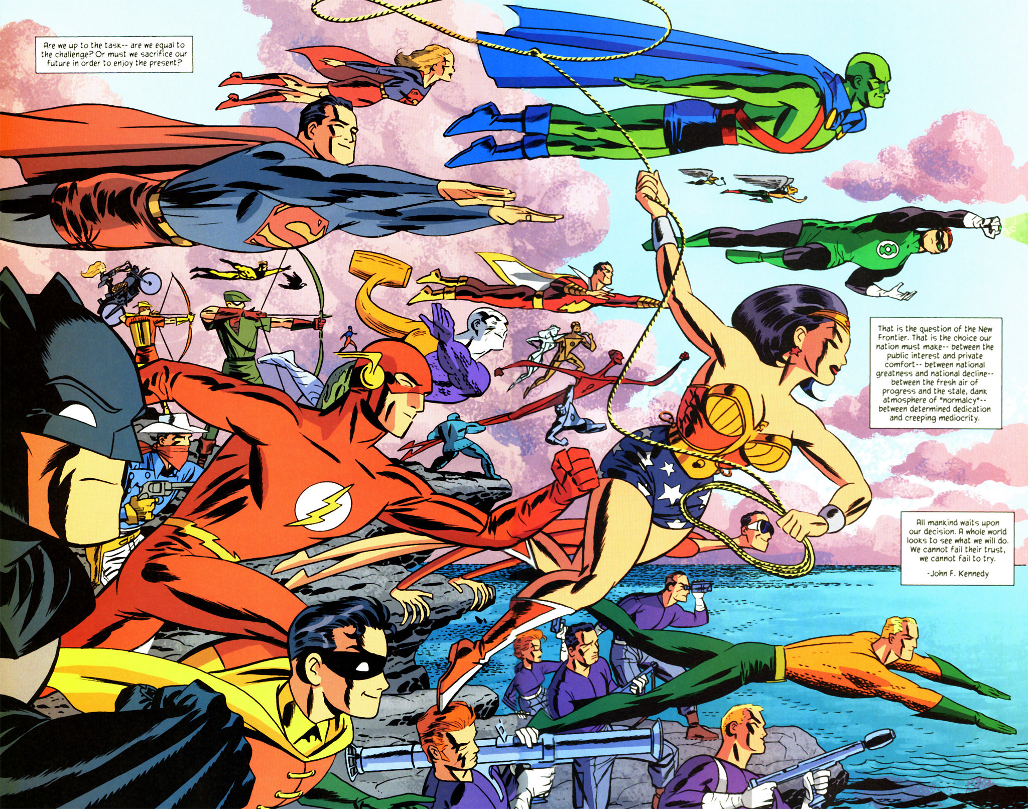
Both of these things came out in the 2000's and Brave and the Bold doesn't have a great artstyle but the character designs are at least good. STEAM also looks like a cheap knock off. I don't think the artstyle would bother me so much if the character designs weren't trash.
 

cybroxide

Member
I'm not a big fan of the extremely dense line work for the promotional art. As for the in-game art, since it's 3DS I need to see it in motion to judge it.
 

Marjar

Banned
Eh, the artstyle could be better, but I don't get the big deal over it. Game will be great regardless.

People had a similar reaction to Link Between Worlds' artstyle and that game ended up being not only one of the best games of last year, but also the best Zelda game in a long time.
 
The aesthetics aren't wowing me, but I'm waiting to see it in motion. The gameplay details sound great and it's IS so it still has my interest.
 
Eh, the artstyle could be better, but I don't get the big deal over it. Game will be great regardless.

People had a similar reaction to Link Between Worlds' artstyle and that game ended up being not only one of the best games of last year, but also the best Zelda game in a long time.

No, people's problem with ALBW's art was that it looked boring and soulless like the NEW series.
 
The char designs are a little overwrought. The still screens look very messy

Yep, even if im liking the artstyle I dont know if I can say the same things for the weapons. I understand theyve tried it to make as patriotic parodic as possible being that convulted, but I dont think it translates well to the eye.
 

Lunar15

Member
The char designs are a little overwrought. The still screens look very messy

Yeah, it's kind of all over the place graphically. They screwed themselves when they brought up silver age comics.

Whatever, I'm still absolutely sold on this. Fire Emblem: Path of Radiance looked like shit on the gamecube, and it's still one of my favorite games of all time. I really trust this team.
 

Jintor

Member
The heavy edge fingers are very familiar but I can't think of the right artist to search up the artstyle right now. Almost scott pilgrim-ish but o'malley uses way smoother/rounded lines in places
 

Dead Man

Member
The heavy edge fingers are very familiar but I can't think of the right artist to search up the artstyle right now. Almost scott pilgrim-ish but o'malley uses way smoother/rounded lines in places

Can't place them myself, but I've been out of comics a long time. They are ridiculous regardless. :)
 
The graphics look a lot better uncompressed. /obvious

Still don't like the fidelity, but it's a 3DS game. Maybe if it does well enough we'll get an HD version!
 

Lunar15

Member
The heavy edge fingers are very familiar but I can't think of the right artist to search up the artstyle right now. Almost scott pilgrim-ish but o'malley uses way smoother/rounded lines in places

Kind of reminds me of Gaucamelee for some reason, even though guac didn't actually do that.

Definitely reminds me of something else though.
 
Top Bottom