encephalon
Member
Lol how dare people want new Nintendo IPs to be visually appealing.
Lol how dare people want new Nintendo IPs to be visually appealing.
When is the video supposed to go live
Lol how dare people want new Nintendo IPs to be visually appealing.
Why is it rated T for Teen....
Yup. Just not feeling it.Graphically/Aesthetically it looks like complete shit.
This is definitely NOT Fire Emblem art director work.
Why are people acting like those who don't find the art style appealing are against new ips. The game is still a ways off so it could change, but that doesn't mean people can't express opinions on what was given to them.
Why are people acting like those who don't find the art style appealing are against new ips. The game is still a ways off so it could change, but that doesn't mean people can't express opinions on what was given to them.
"NINTENDO MAKE SOME NEW IPS REHASHING FUCKS"
*shows a totally new IntSys IP*
*sees the screens, zero video at all*
"LOOKS LIKE SHIT WHERE THE FUCK IS MAJORA"

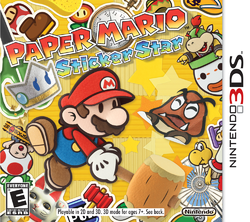
It is.but Sticker star is the best paper Mario game
Why are people acting like those who don't find the art style appealing are against new ips. The game is still a ways off so it could change, but that doesn't mean people can't express opinions on what was given to them.
I was at the roundtable, and I must say: in one hour, the game grew from a resounding "meh" since the initial reveal to a must-buy status after hearing the developers talk about it. They all knew exactly what they were talking about, communicating perfectly what they were striving for, their influences, the strengths of the game, and so on.
Besides, in Intelligent Systems we trust.
Edit: Oh, and the game looks great in action.
Another edit: I see people aren't fond of the art style. I wasn't at first too, but after they threw the explanations and a couple of funny in-game jokes at us, I was convinced. It's supposed to be inspired by Jack Kirby's art.
I personally would have preferred a slightly sleeker visual style, with more intense colors - I actually kinda like the colors on the STEAM cover, with the nice orange/purple color contrast, but the screens look very dim and muddy, and I don´t know how much "being in motion" will change that.
Something like this: